


brand identity
DLUX Smile
Dlux Smile is a professional dental staffing agency based in the South-West of England, offering reliable locum cover for practices across the region. With over 16 years of experience, they pride themselves on being more than just a temp service — they’re a trusted extension of the dental teams they support.
Their approach is warm, fast, and personal — especially important in rural areas, where finding last-minute cover can be more challenging. Whether it’s for a single shift or long-term placement, Dlux Smile delivers with professionalism and a distinctly human touch.
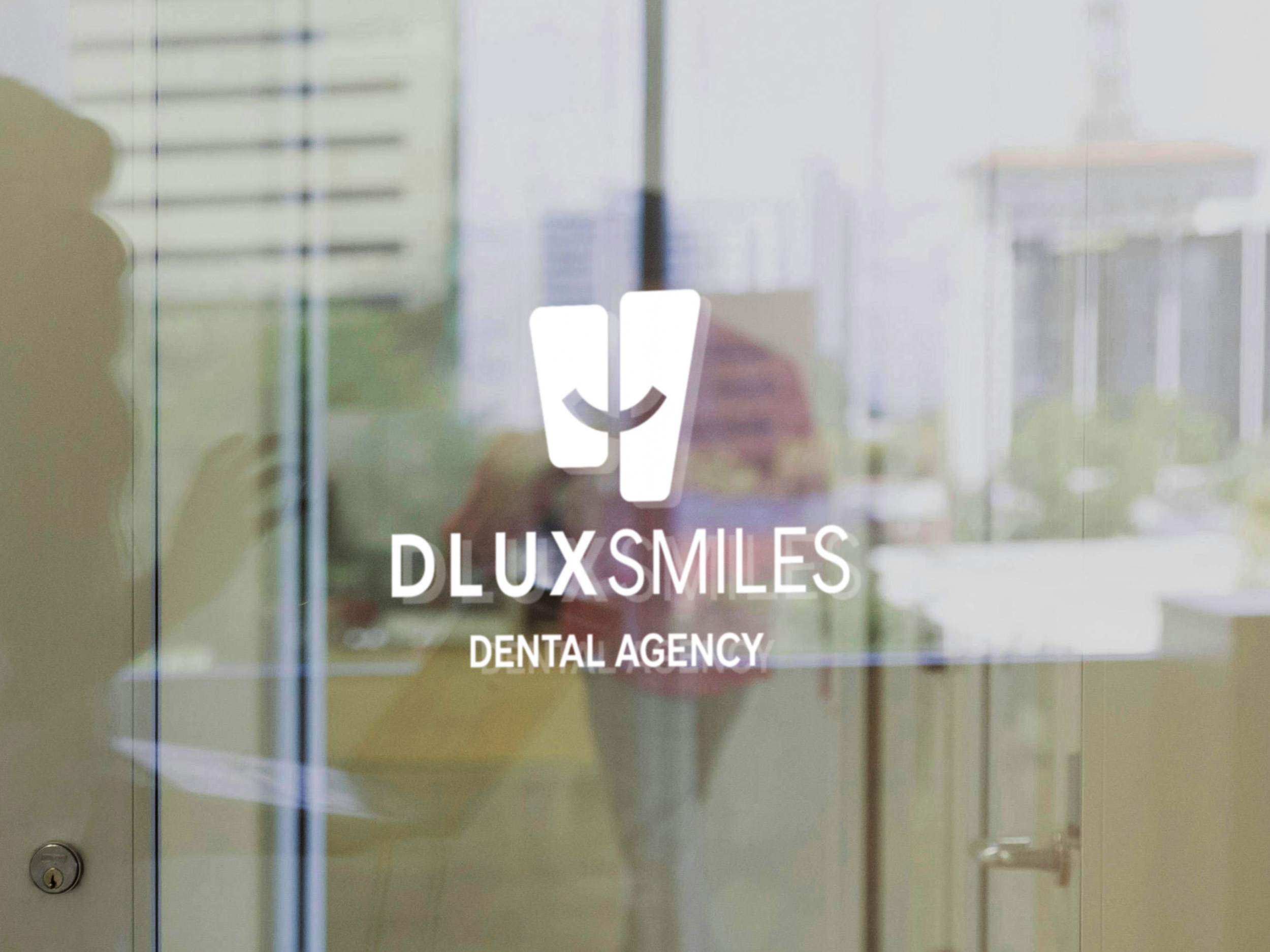
Back for a Second Smile
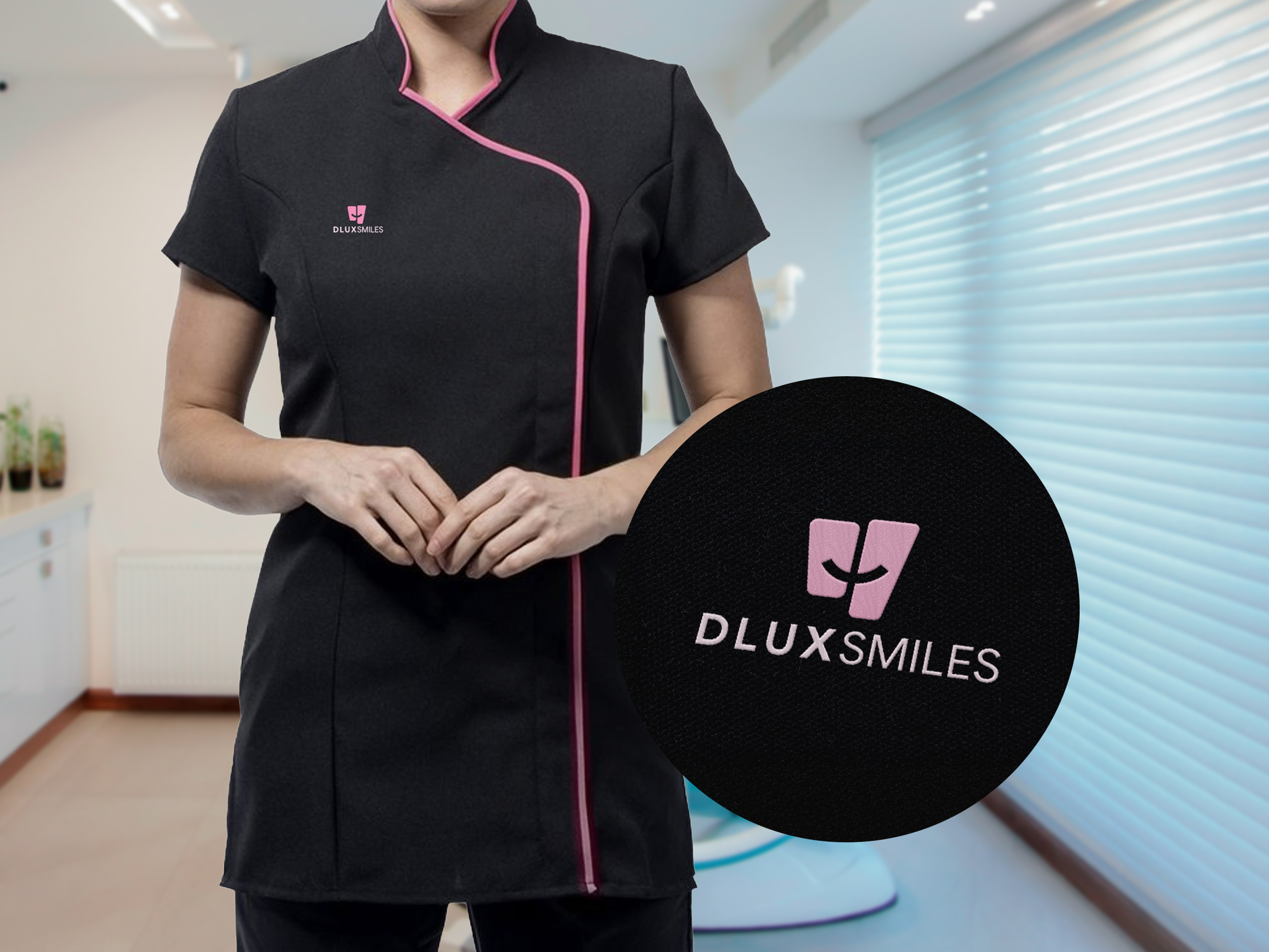
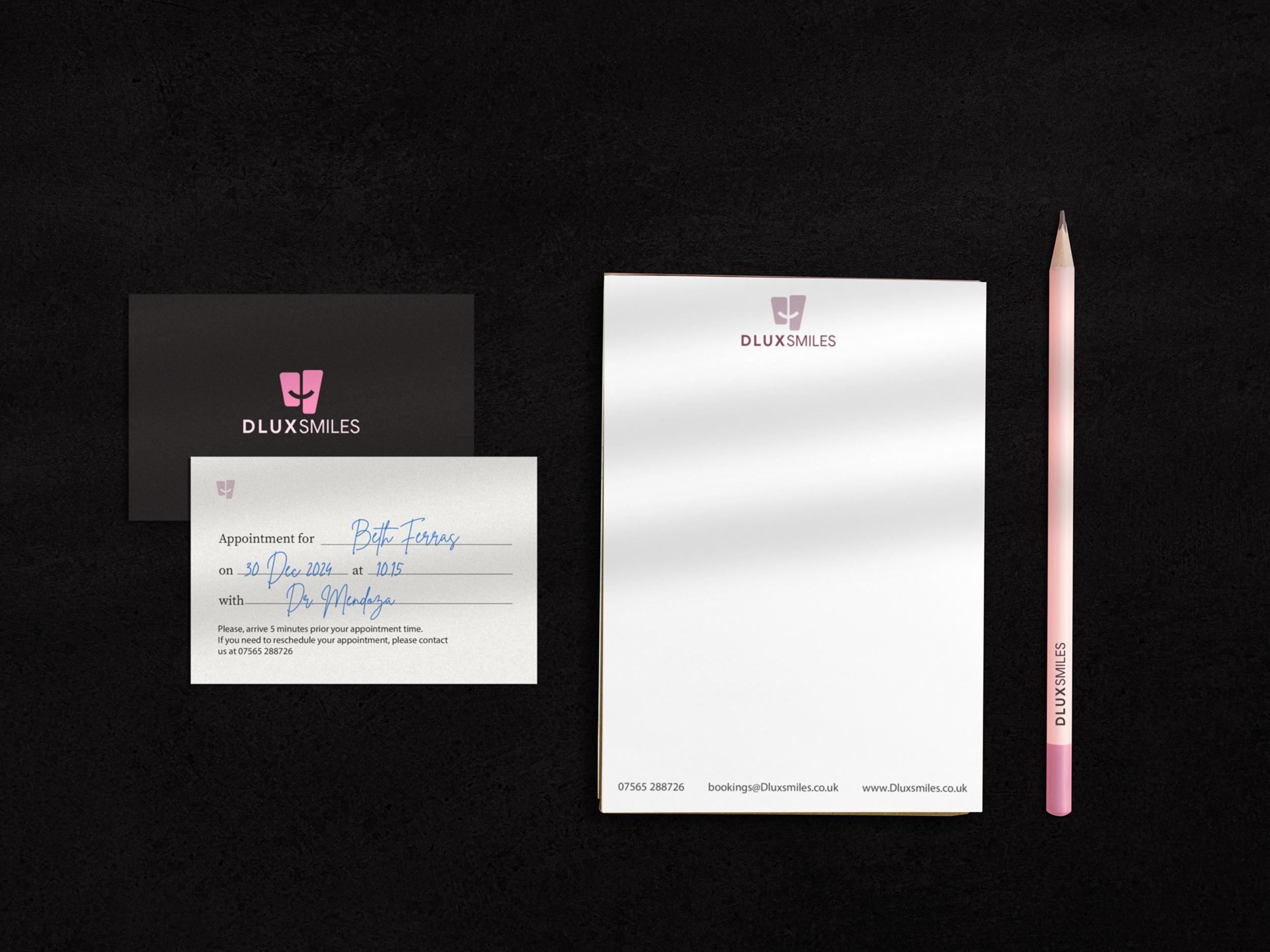
This was actually my second time working with Rosanna and Carmelita, the two sisters behind the business. They got in touch again because they were refreshing their brand and needed a new logo and a set of supporting materials — business cards, notebooks, uniforms and appointment cards.
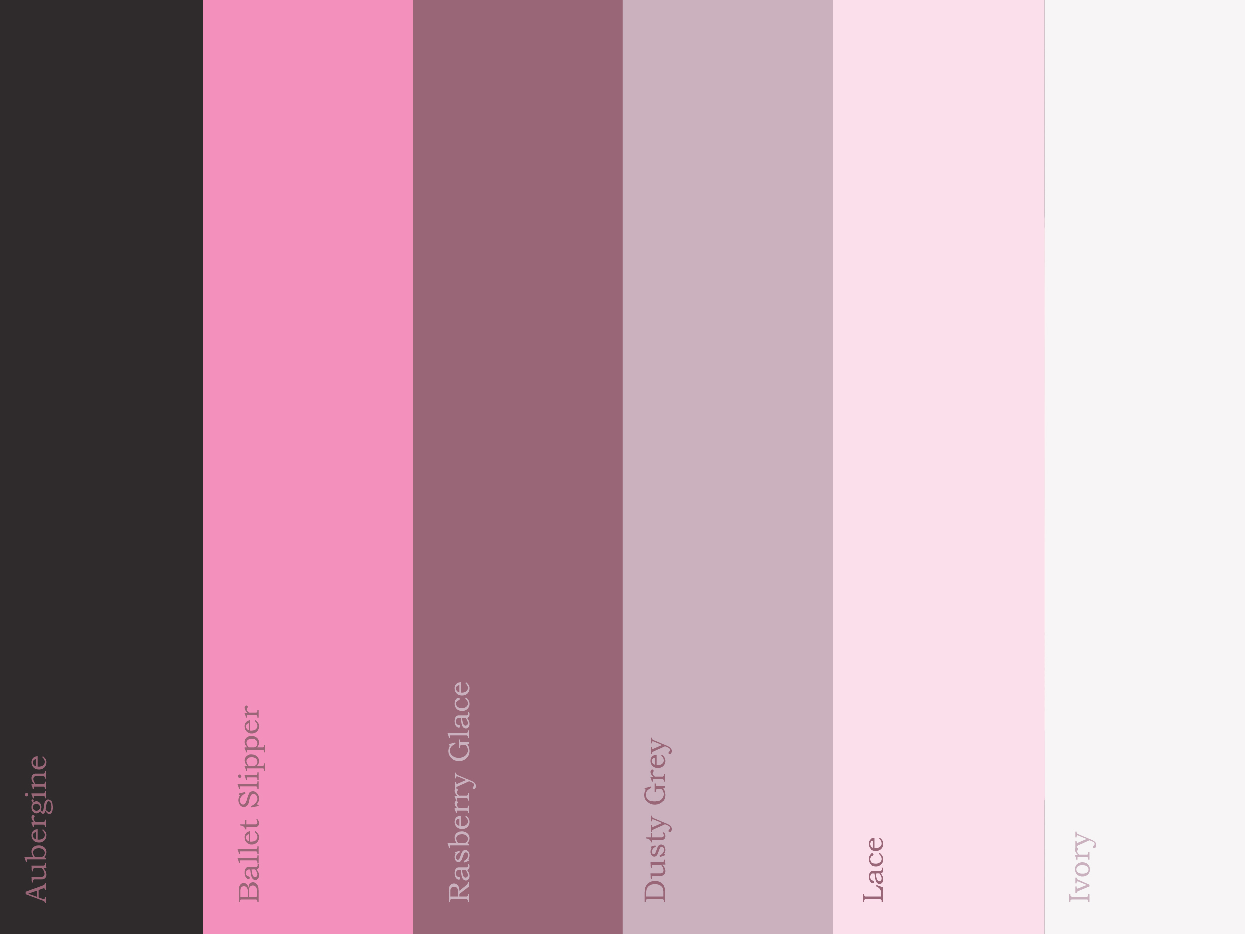
They had a clear direction in mind: something soft, modern, and slightly unconventional for the dental world. They specifically asked for a pink-toned colour palette, a choice that might surprise some, but felt right for the friendly, approachable tone of their service.
Telling a Story in One Simple Shape
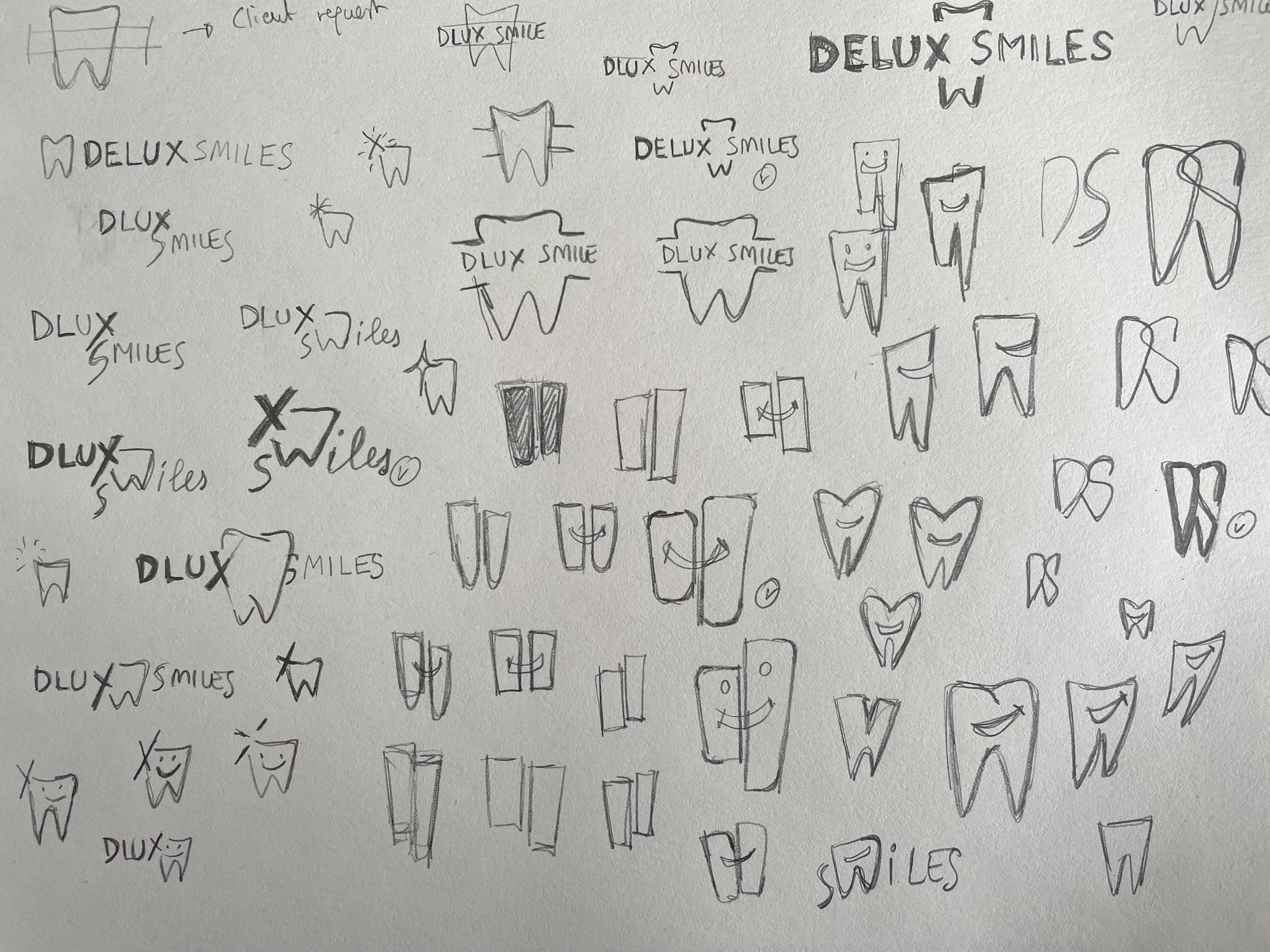
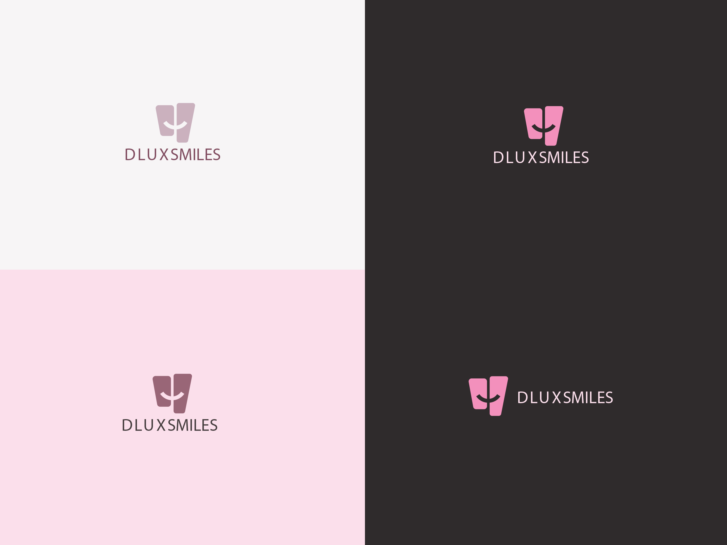
The concept behind the logo came from their own story — two sisters, working side by side, building something together. I explored how to bring that bond into the design, and eventually found a way to combine a tooth, a smile, and the number two into a single, clean symbol. (There’s a visual explainer for this — trust me, it makes sense when you see it.)
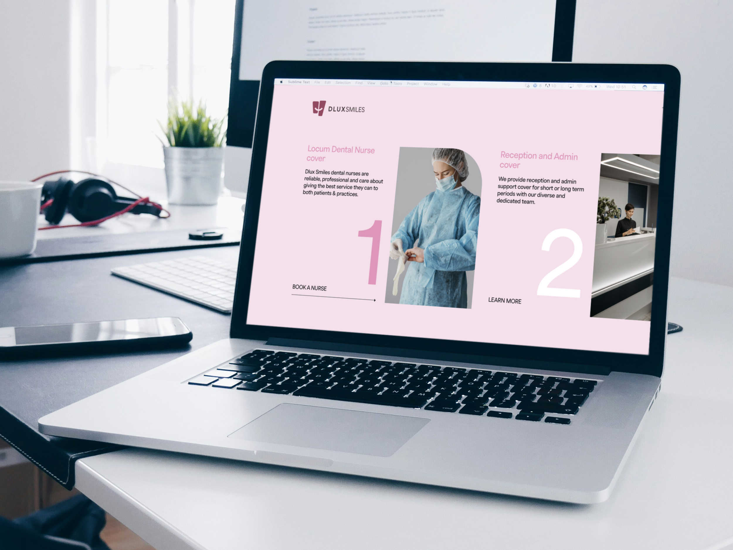
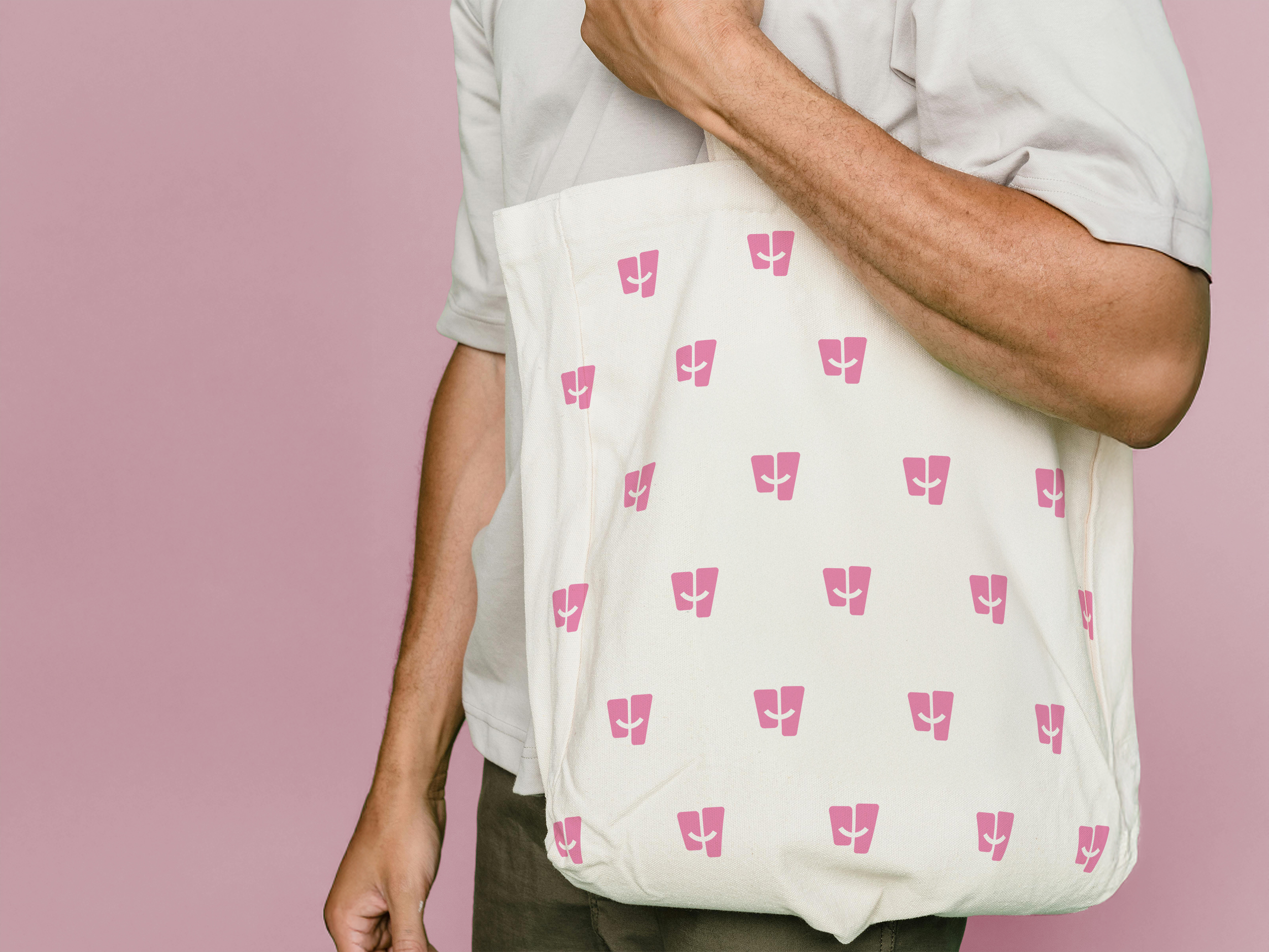
The final identity feels friendly, distinctive, and just a little bit playful — exactly the balance they were after. Once the logo was signed off, I rolled out a small suite of branded collateral, including uniforms, stationery, and client-facing materials.
It may have been a compact project, but it was a pleasure to work on — and always a joy collaborating with people who genuinely care about what they do.
Lovely words
“We wanted something that felt premium without being cold — approachable, but not cliché. Igor’s work nailed that tension. The brand identity he created for us feels modern, refined, and completely distinct from the generic clinical look we see everywhere else. Every detail — from the typography to the layout templates — feels intentional. Patients have noticed. So have our peers.”
– Carmelita & Rosanna –