


brand identity
Circuit
Circuit is a next-generation fitness space built around one simple idea: movement in all its forms keeps you moving forward. Founded by Mark, a coach and entrepreneur with a passion for functional training, Circuit is designed for people who want to train hard, stay curious, and keep things fresh.
Based in Bristol, Circuit offers a mix of strength training, CrossFit, spin, HIIT, and recovery-focused classes—all under one roof. Every part of the gym is designed around flow, from the layout of the space to the way members move through different zones. It’s training in a circuit—and a community built on progress.
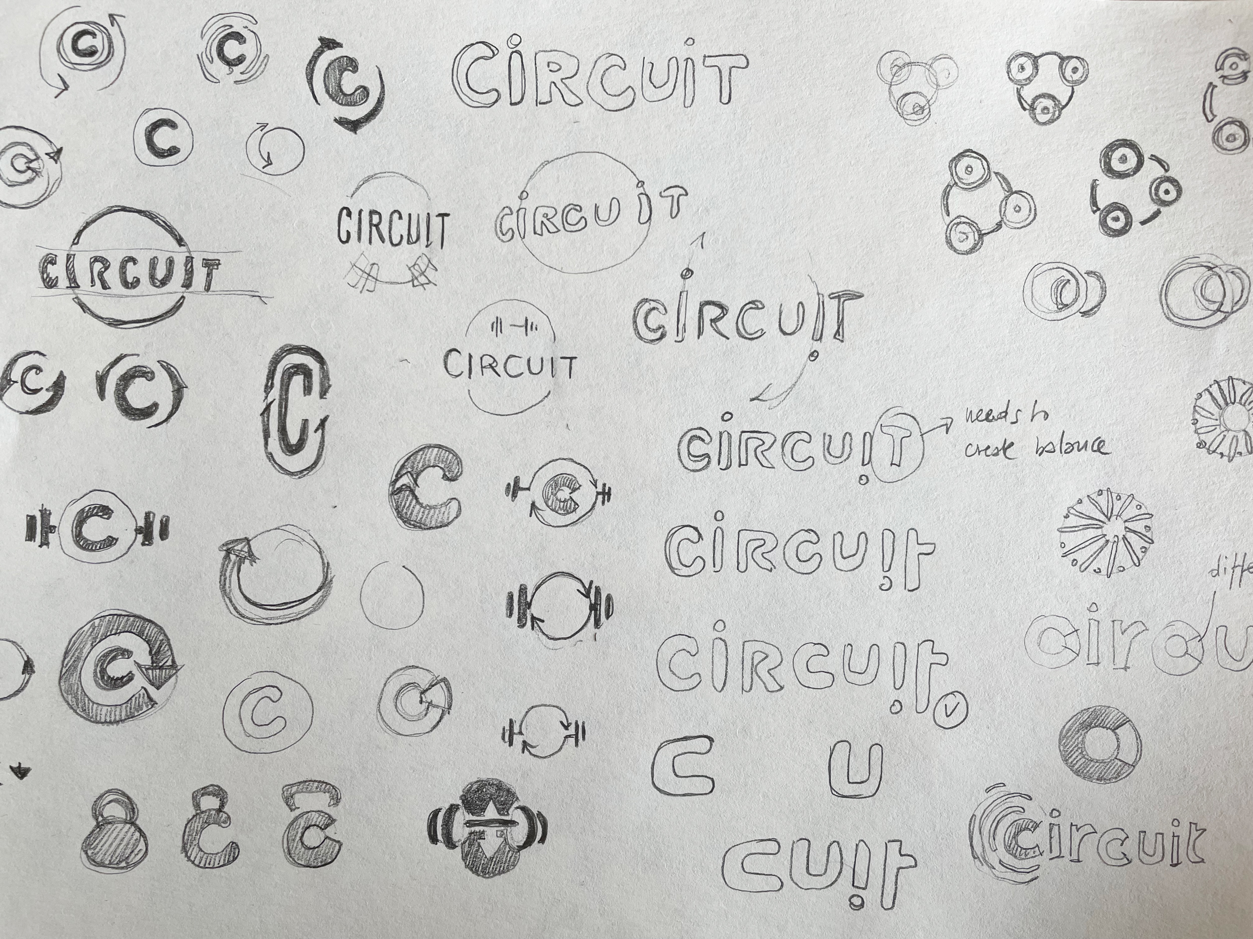
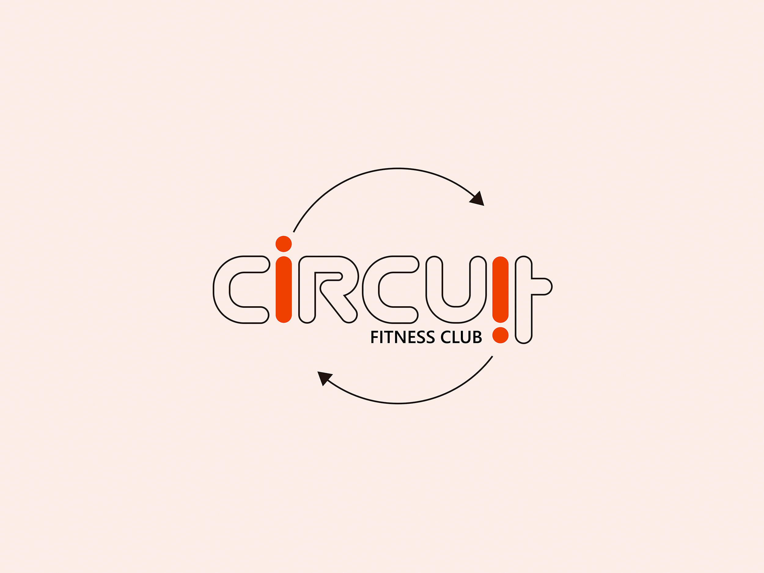
Not your average dumbbell logo
The name Circuit captures the philosophy at the heart of the gym: variety, energy, and ongoing improvement. Whether you’re powering through a spin class or pushing PRs on the platform, there’s always a sense of momentum.
When Mark reached out to me, he had a strong vision—he didn’t want the brand to look like every other dark, gritty gym. He wanted something clean, energetic, and flexible enough to grow with the business. A brand that feels like motion.
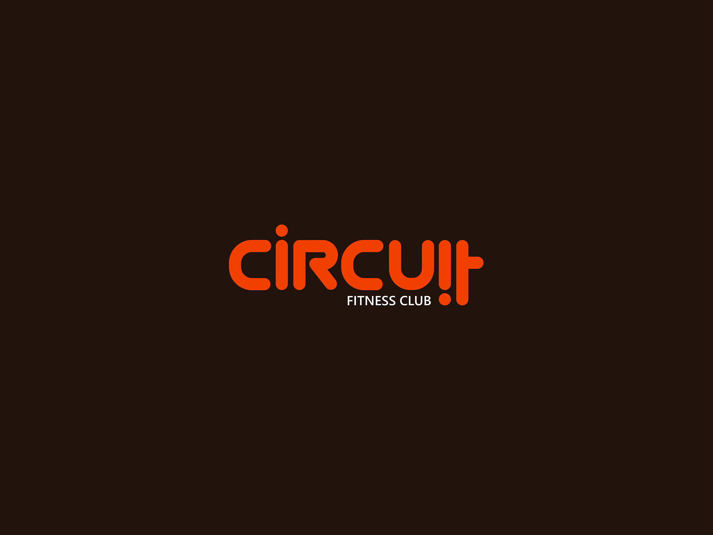
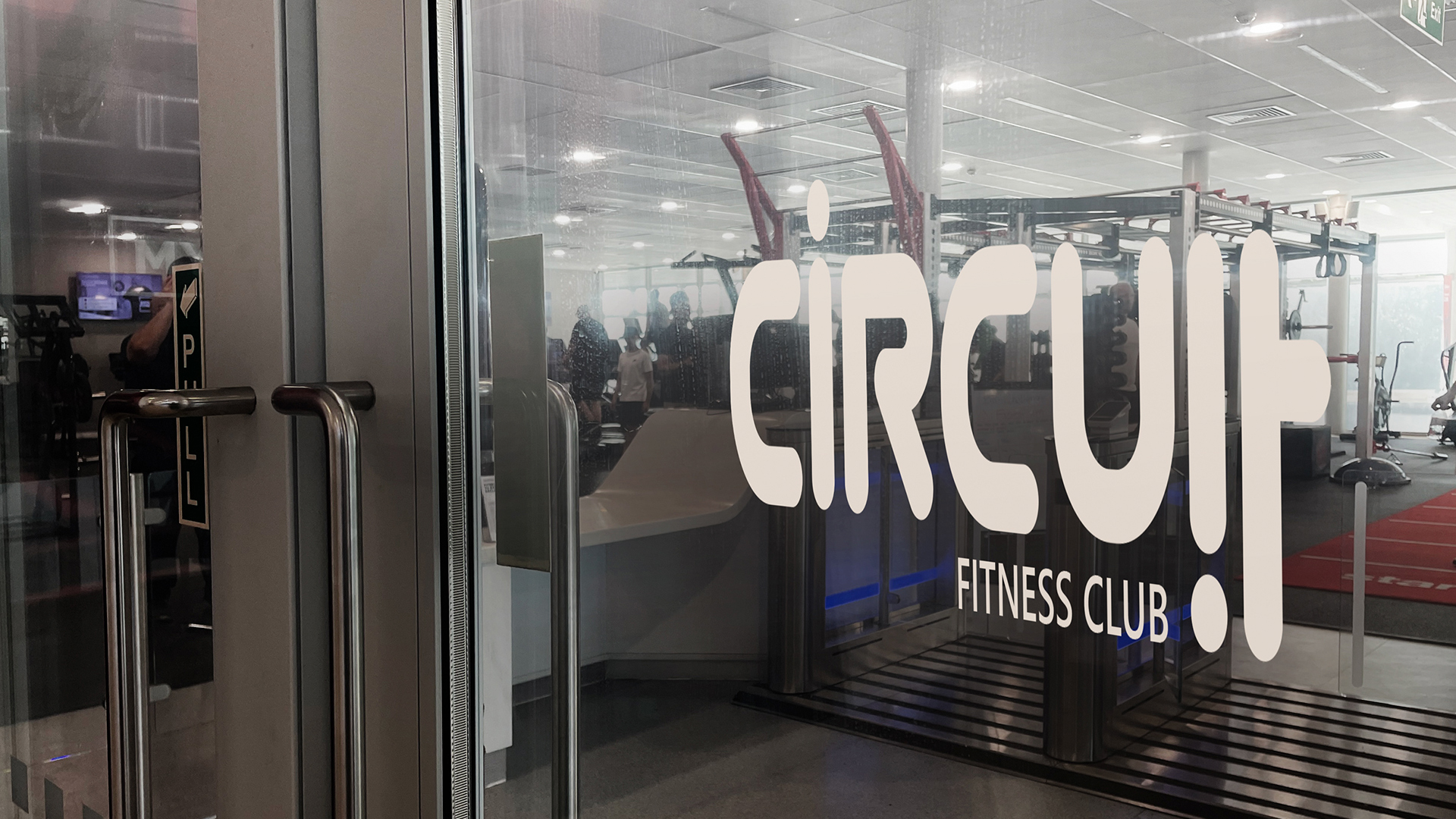
The final logotype is built around subtle visual movement, where the first “i” stands upright, stable and strong, the second “i” flips upside down, introducing rhythm and energy, and the final “t” leans into the same angle, creating a directional pull that echoes the flow of a circuit.
Combined, these details give the wordmark a circular energy, hinting at both physical circuits and the dynamic flow of training.
This gym doesn’t skip Colour Day
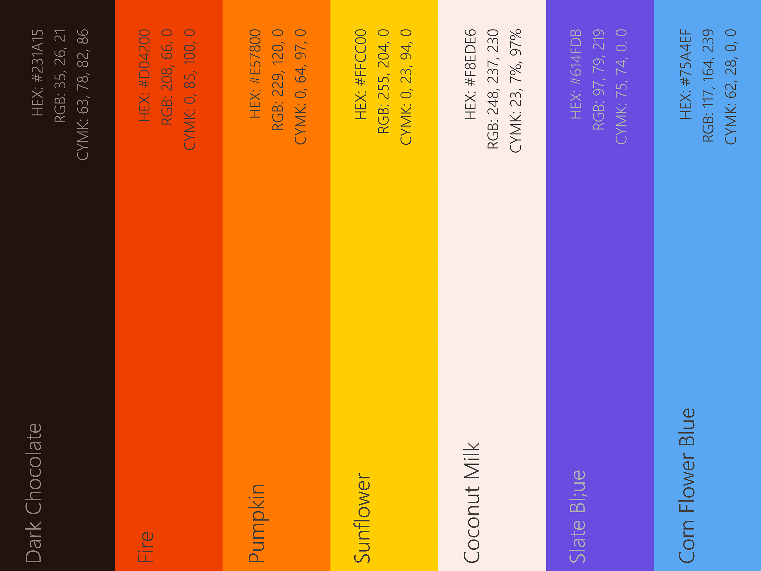
Orange is the heartbeat of the Circuit brand—bright, bold, and full of momentum. It conveys energy without aggression, making it feel motivating rather than intimidating.
To complement the main colour, I developed a functional colour palette, where Orange is the core brand colour, Red the strength zone, Blue is CrossFit rigs & cages, Yellow the Spin studio, Coconut milk represents Mobility & recovery, and Violet Group classes & community sessions. This system allows every space in the gym to feel distinct but still part of the same brand experience.
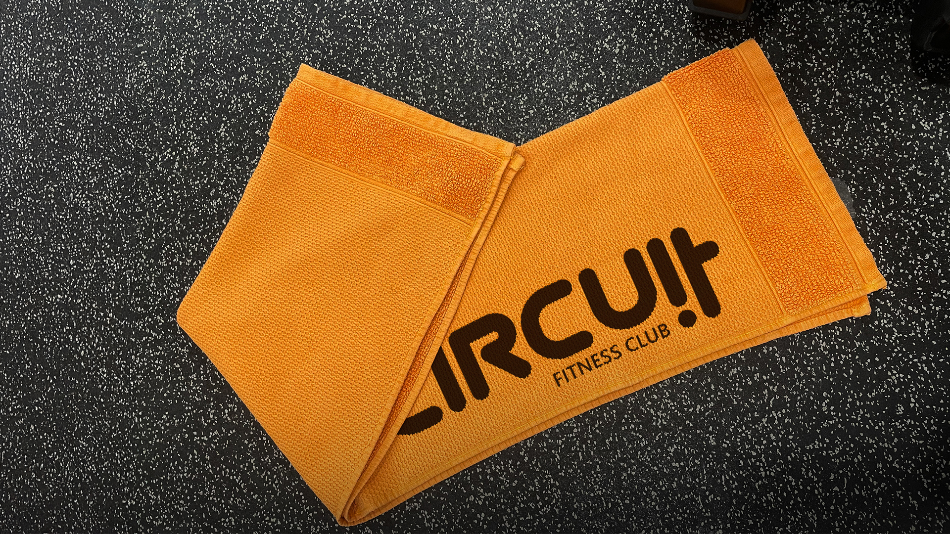
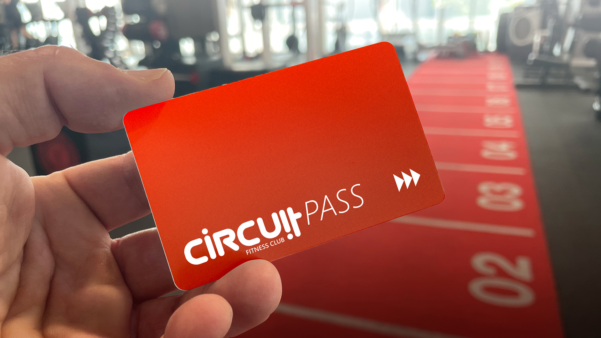
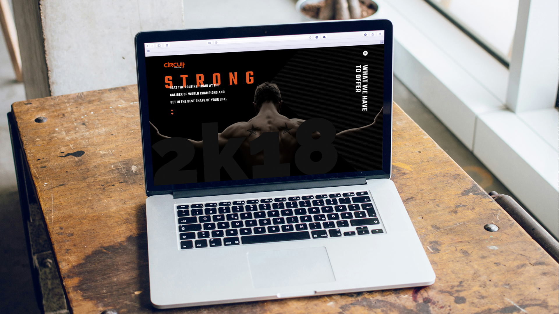
With the identity locked in, I rolled out the design across key collateral to make the experience feel consistent from first visit to everyday use, like branded gym passes and membership cards, custom towels and locker tags, business cards and stationery.
This project was especially fun for me, and not just because I love branding, but because I genuinely love training. As someone who lifts regularly, I understand what makes a gym feel right, and it was a pleasure to design something that speaks to that drive.
Circuit captures what fitness should be: focused, fun, and always moving forward.
Lovely words
“I came to Igor with an idea — raw, abstract, a bit chaotic — and he gave it form without flattening the edge. The brand he built for me is bold, modular, and flexible enough to speak to the full range of voices in our creative network. What really stood out was how he managed to turn vague direction into visual clarity without losing the energy behind it. It looks like me, but sharper, louder, and more confident.”
– Mark Webber –