


brand identity
Vaiani Lieviti
When Andrea Vaiani approached me, he brought with him more than just a design brief — he brought a legacy. Founded by his father Giorgio in 1980, Vaiani Lieviti has long been a quiet force in the natural leavening world. A trusted partner for bakers and pastry chefs across both industrial and artisanal settings, the company has built its reputation on reliability, innovation, and a deep respect for tradition.
Surprisingly, for a brand so central to its field, Vaiani Lieviti had never had a proper logo. That’s where I came in.
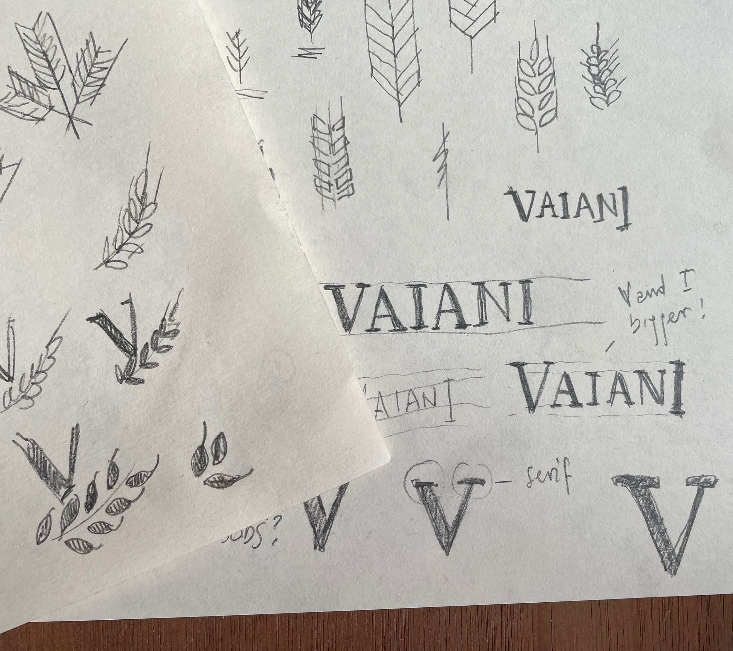
The logo that rose naturally
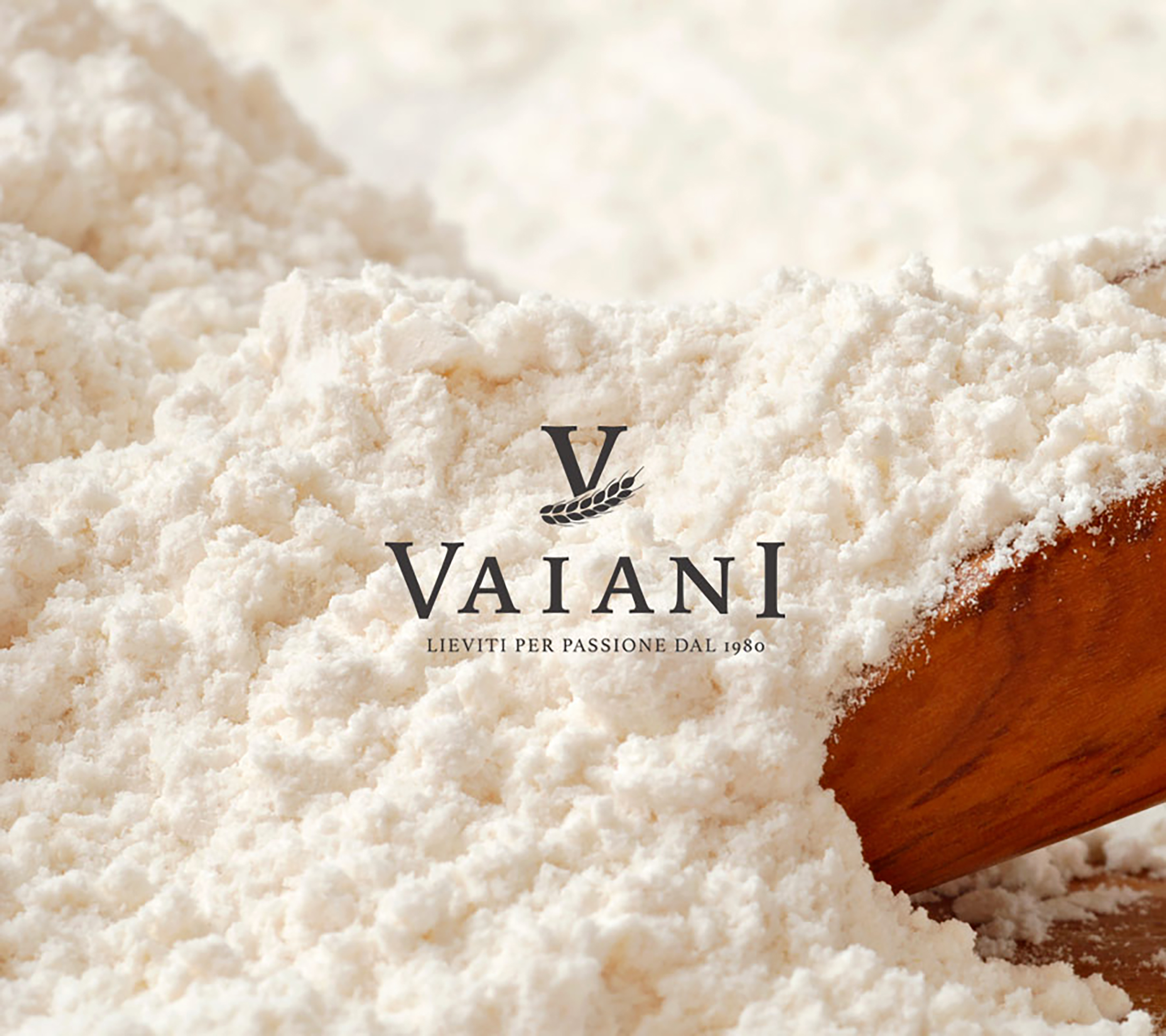
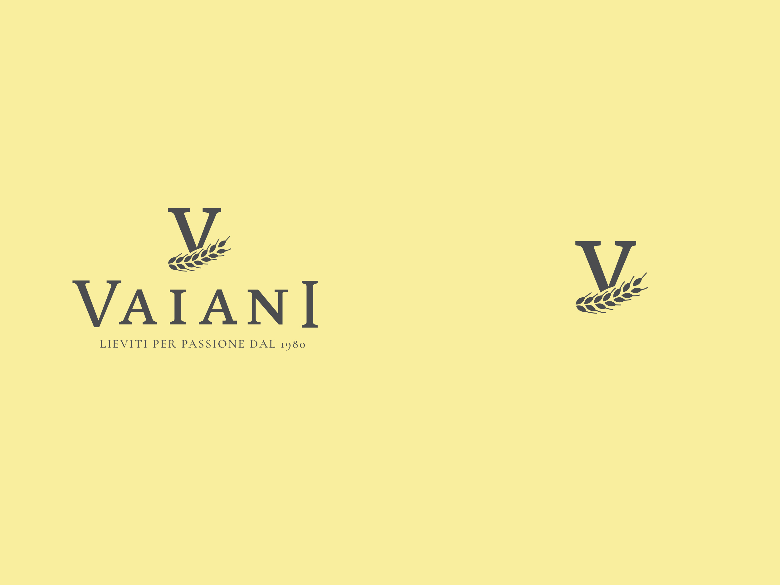
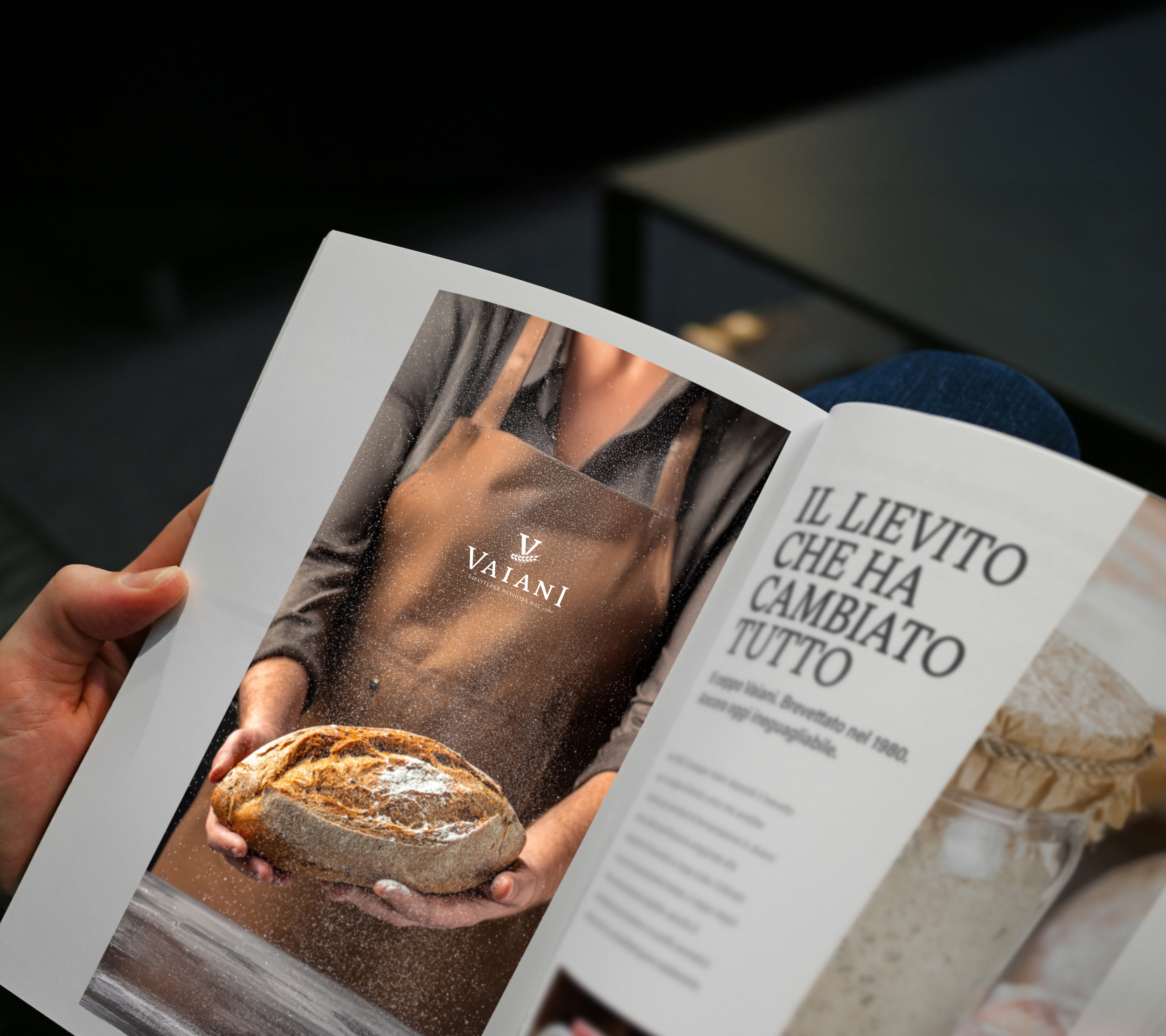
I chose a classic serif typeface to anchor the wordmark — a nod to heritage, craftsmanship, and time-honoured processes. Nestled beneath the initial “V” is a single ear of wheat, delicately drawn. It’s a quiet symbol, but one that carries weight: growth, nourishment, and the natural origins of their product.
I wanted the logo to feel timeless and grounded — the kind of mark that could live comfortably on a sack of flour, a laboratory report, or a decades-old family photo. It’s confident without being flashy, and just like the yeast it represents, it does a lot behind the scenes.
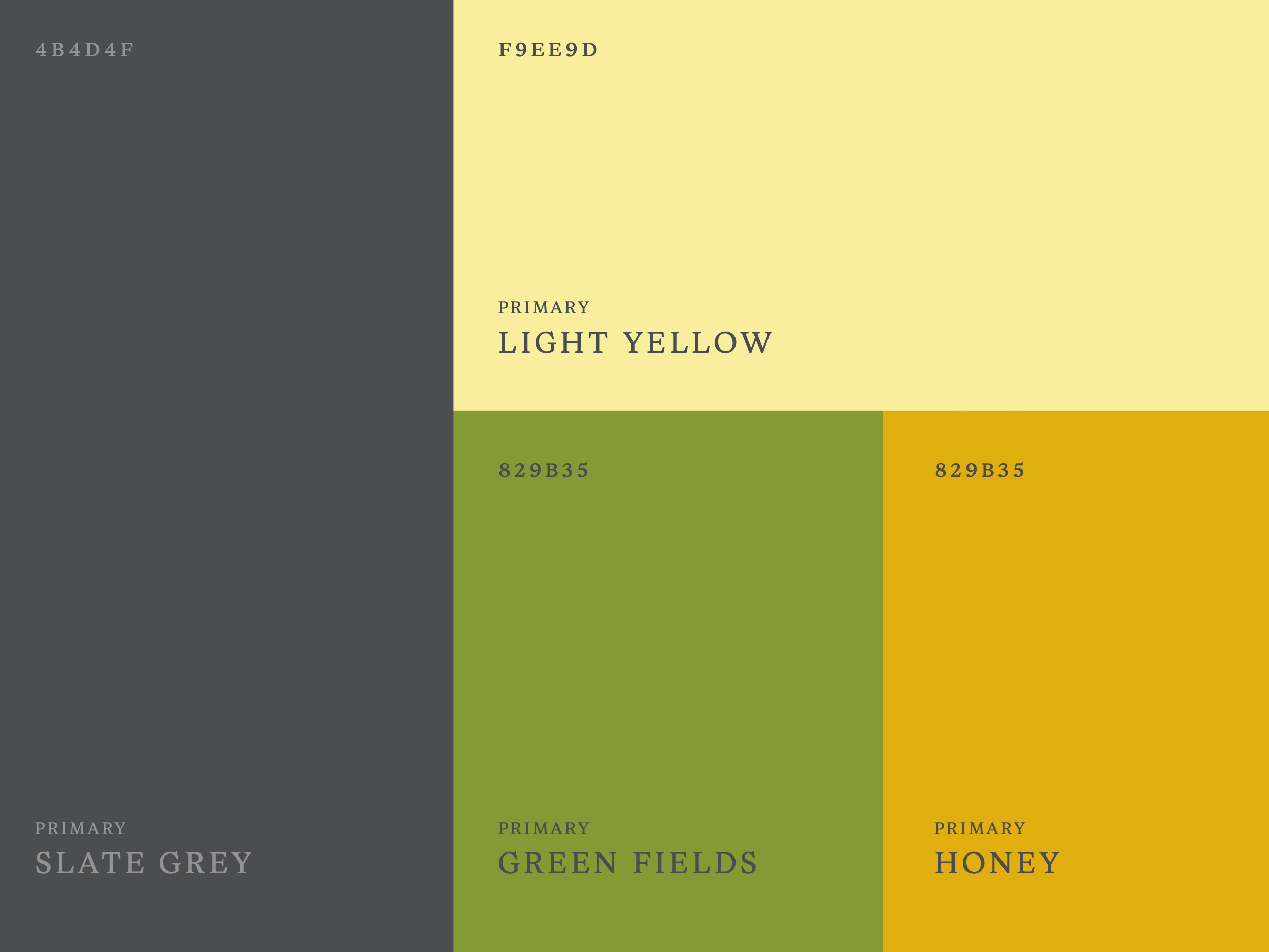
Colour-coding, crumb by crumb
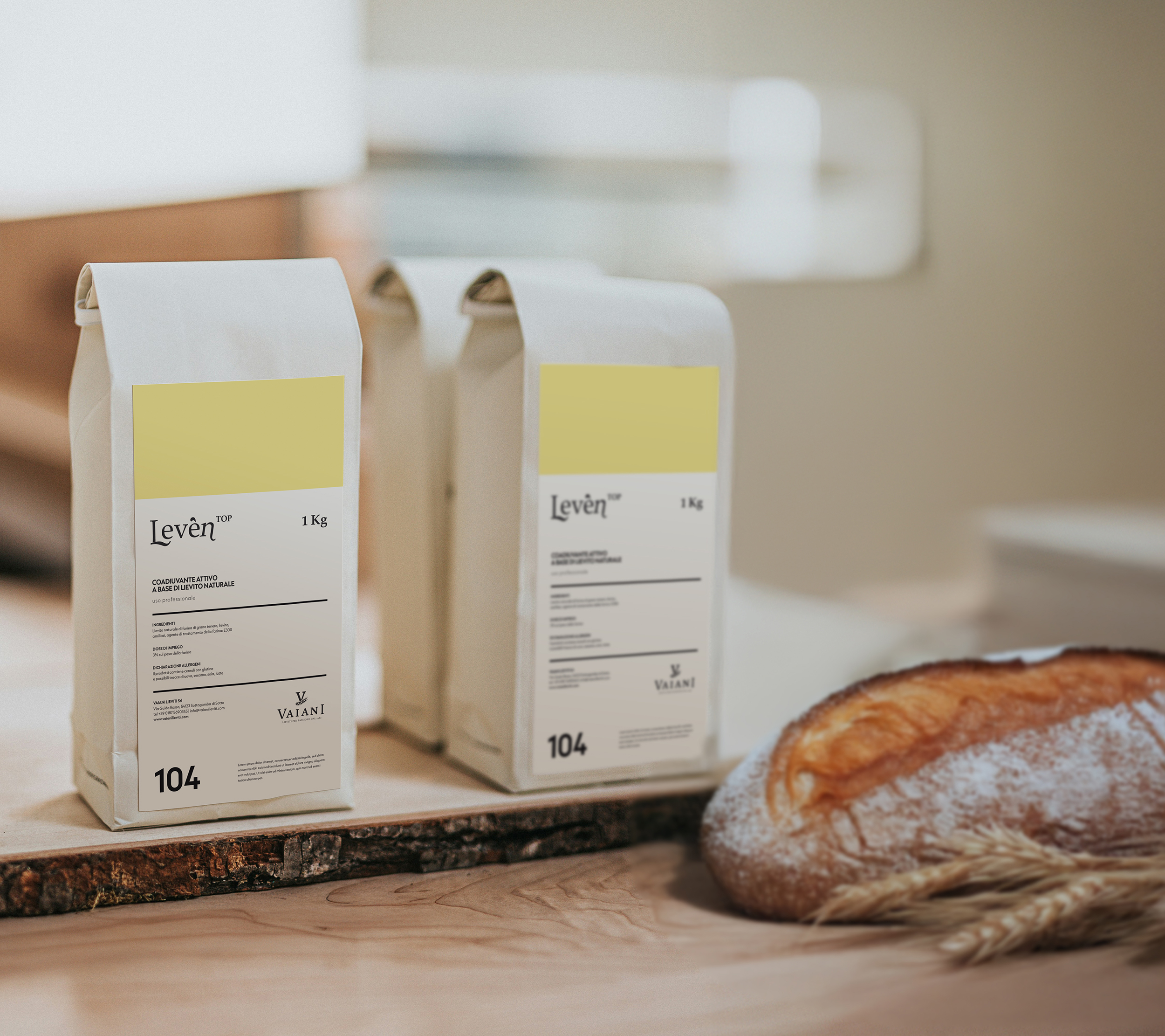
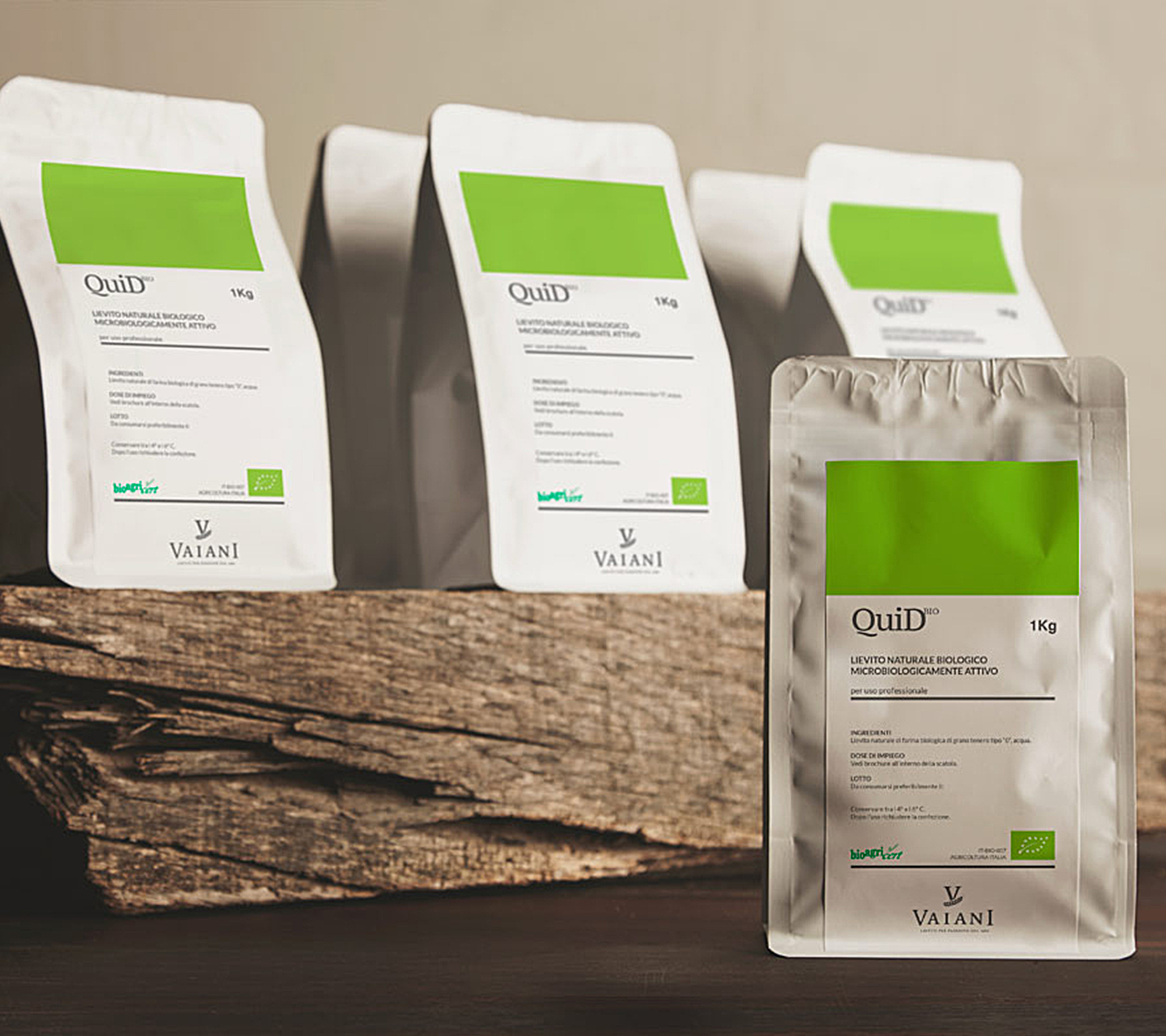
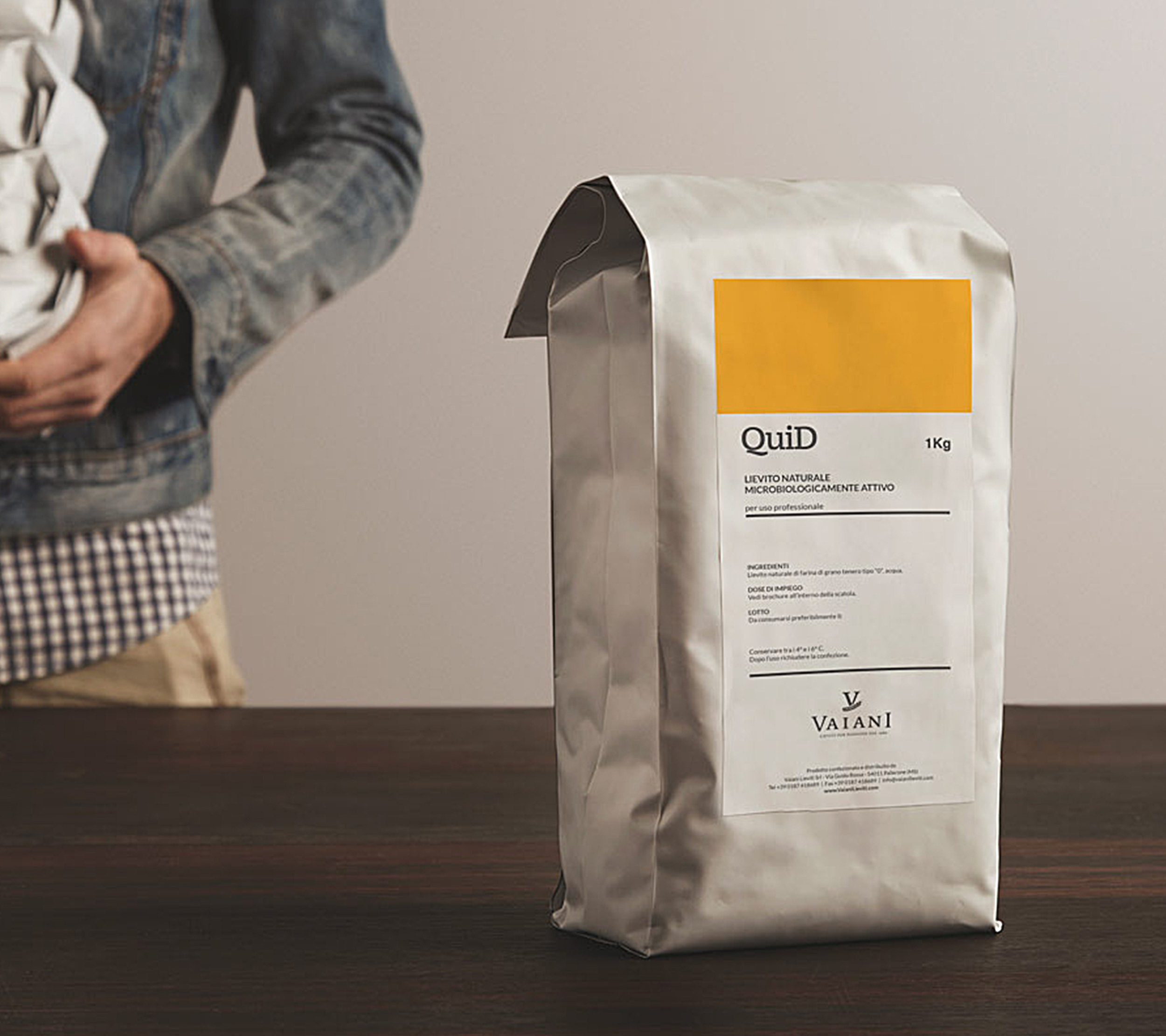
Once the identity was defined, we brought it to life across a small ecosystem of branded materials, starting with a product brochure and continuing through to a full sticker system for packaging.
Each sticker corresponds to a different yeast variant, distinguished by colour to make selection effortless — especially useful in the fast pace of a working bakery. Whether a product is destined for panettone, pizza dough, or sourdough, the design makes it clear, clean, and accessible.
Projects like this remind me that design isn’t always about reinvention — sometimes, it’s about distillation. About putting shape to something that’s already there: tradition, care, pride in the product. Vaiani Lieviti didn’t need a new story. They just needed a way to show the one they’ve been living for over 40 years.
Lovely words
“There’s something tricky about working with heritage — you want to honour the past without getting stuck in it. Igor found that balance right away. He was genuinely interested in the story behind our company, from my father’s patent to today’s production methods. The identity he created is smart, clean, and respectful of our legacy. It’s exactly what we needed to face the next chapter with confidence.”
– Andrea Vaiani –