
isometric illustration
O2 Telecommunication Company
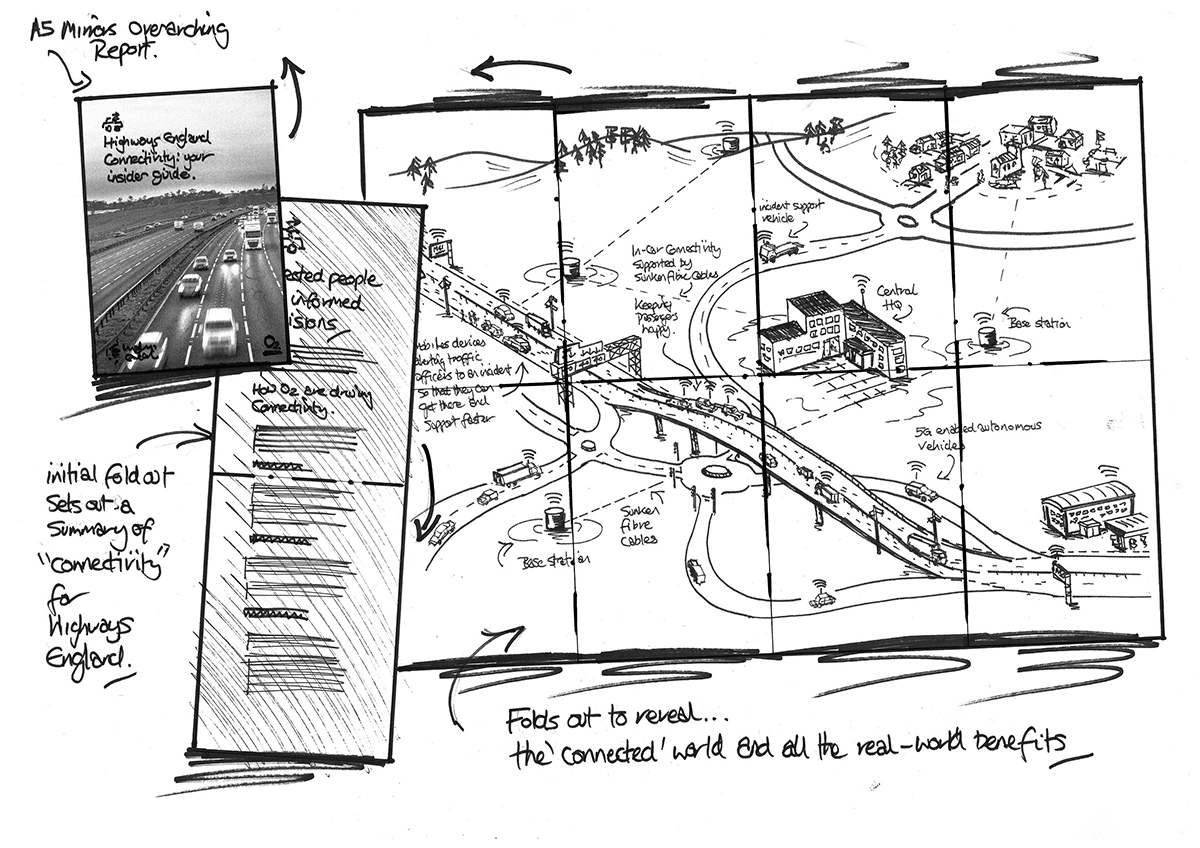
The Marketing Practice got in touch with a unique brief: create a large-format isometric illustration for O2, one of the UK’s biggest telecom companies, to support their Highways England Insider Guides campaign.
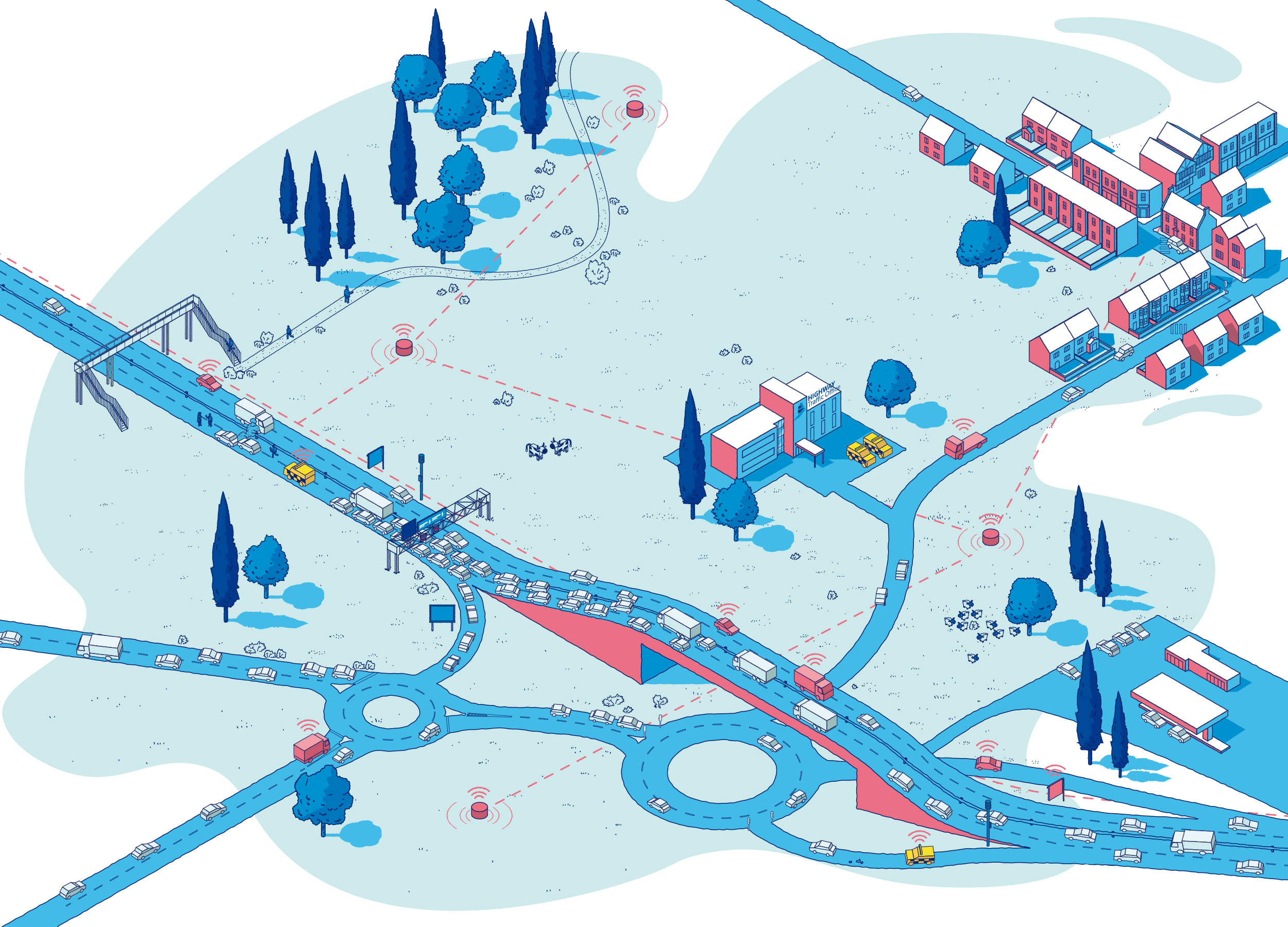
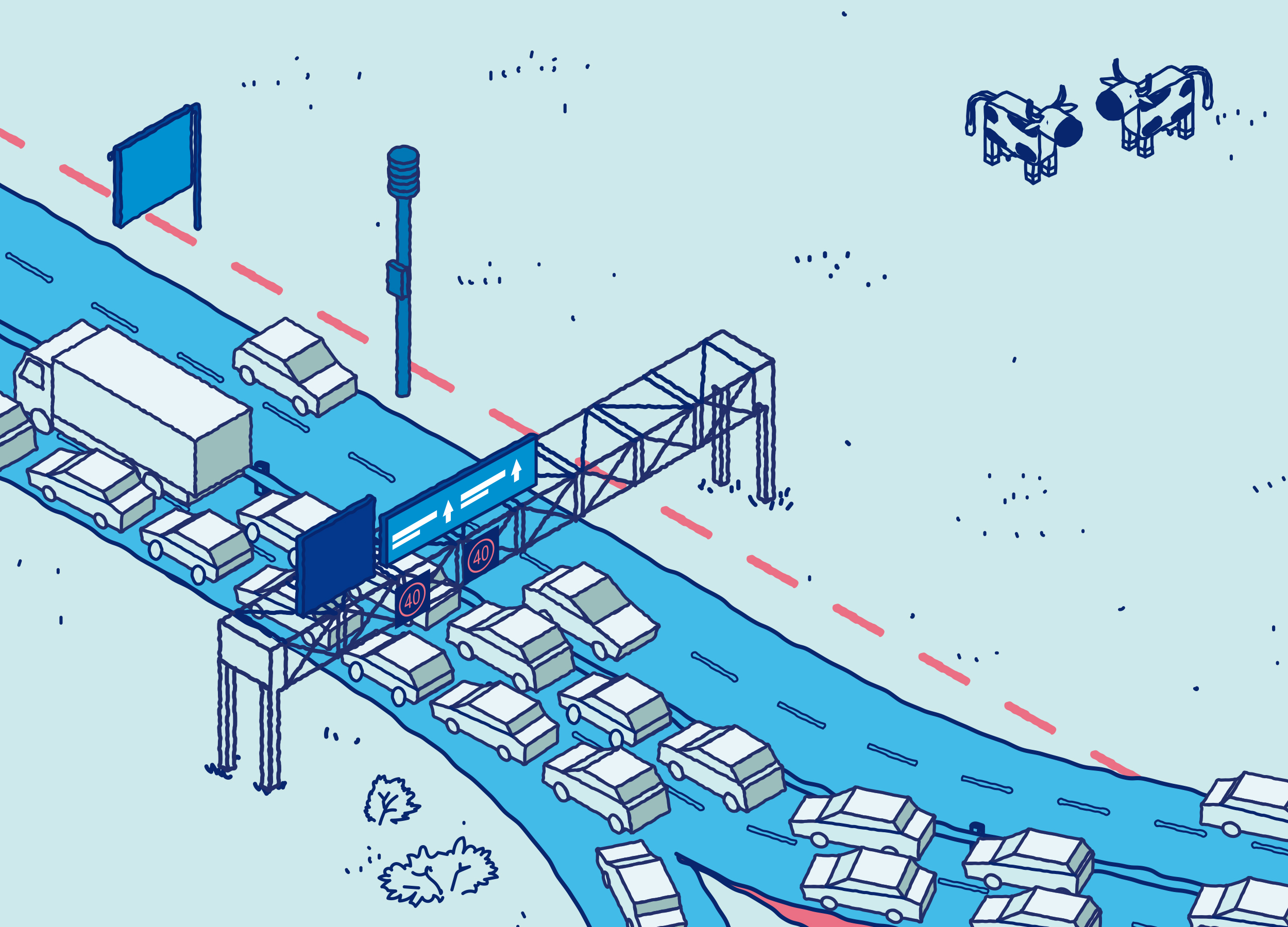
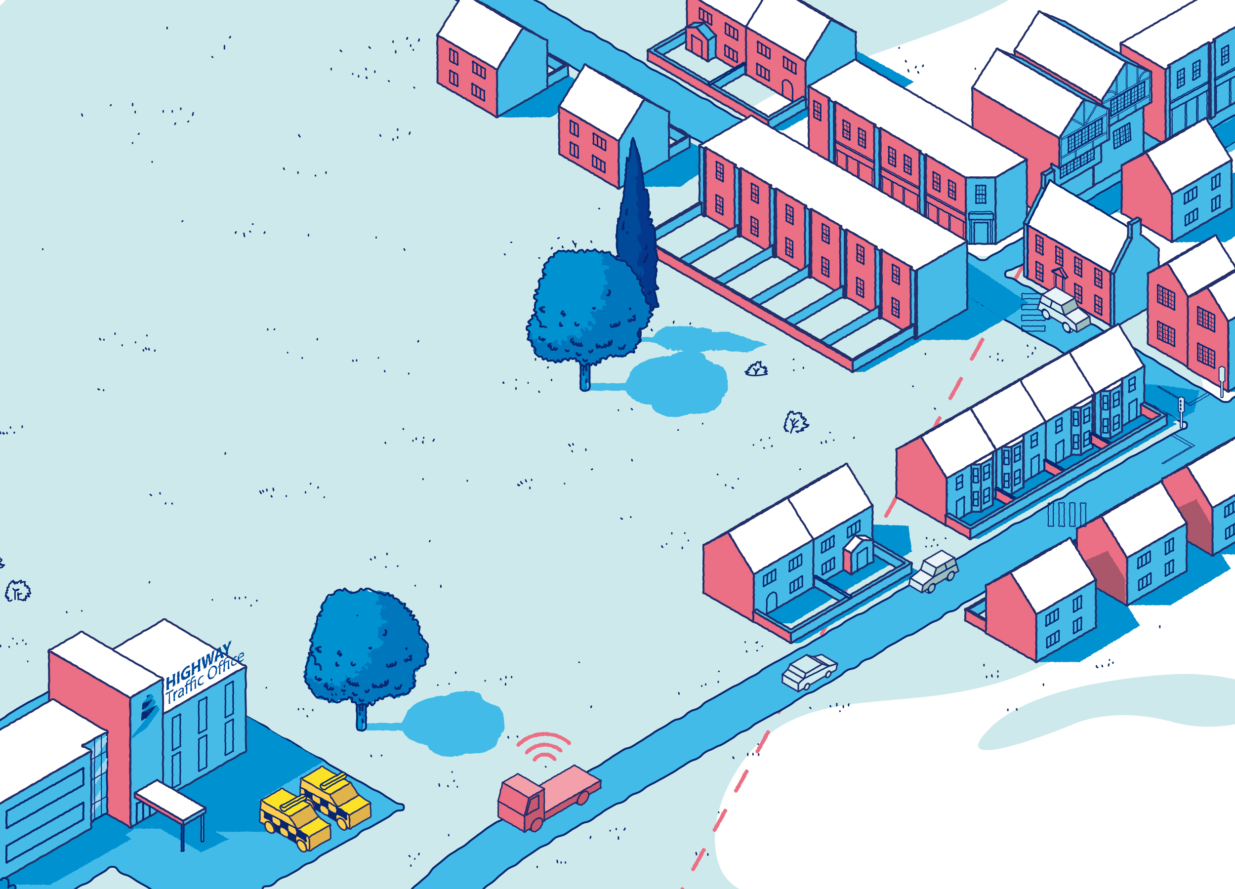
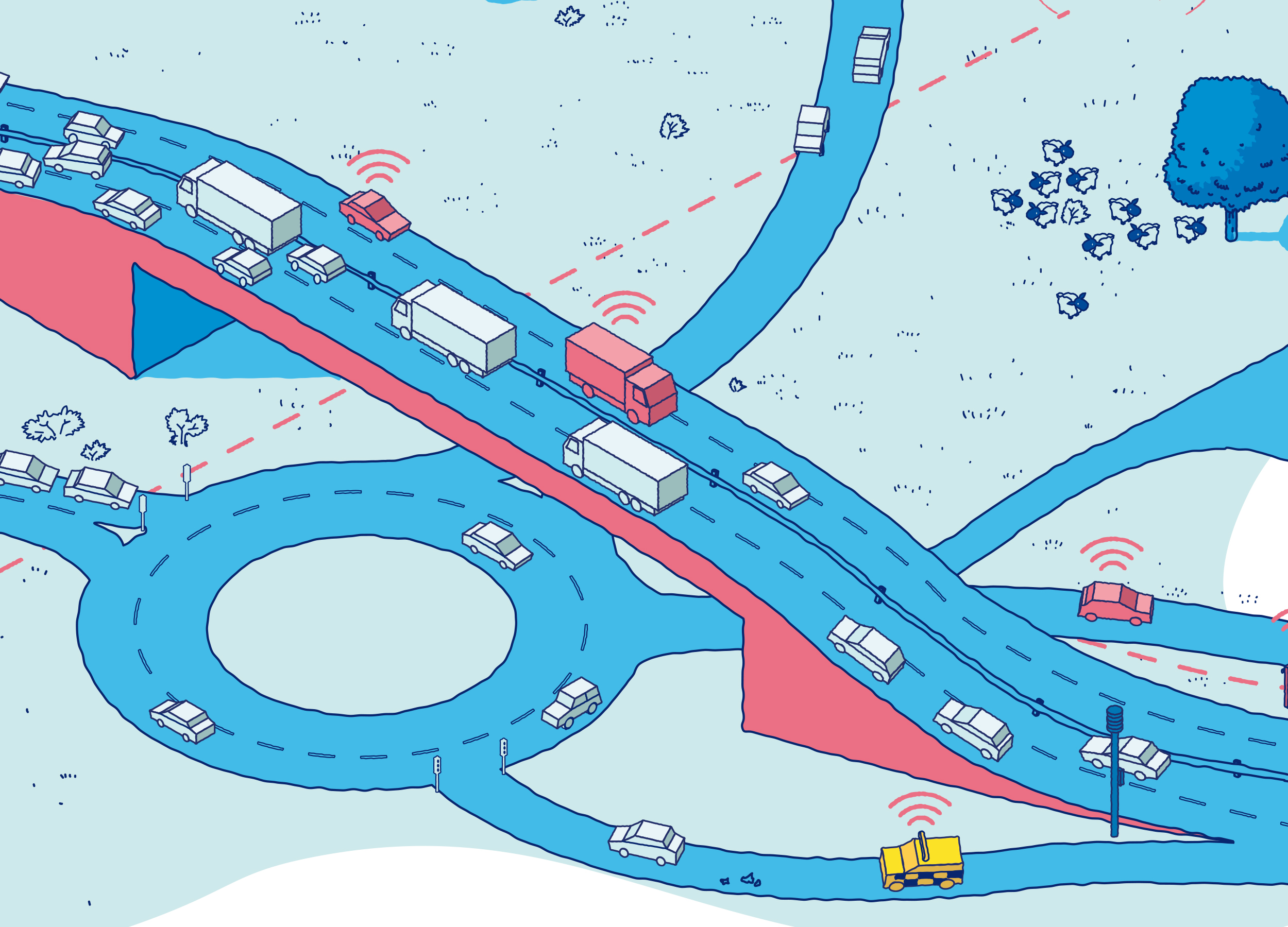
The goal was to produce a visual snapshot of Highways England’s world — a detailed scene featuring their headquarters, traffic officers at work, a motorway with a gantry, and a townscape fading into the distance. The finished piece would be printed as a fold-out A2 poster, distributed as a compact A5 and designed to open out into something immersive and informative.
A Softer, more human isometric style
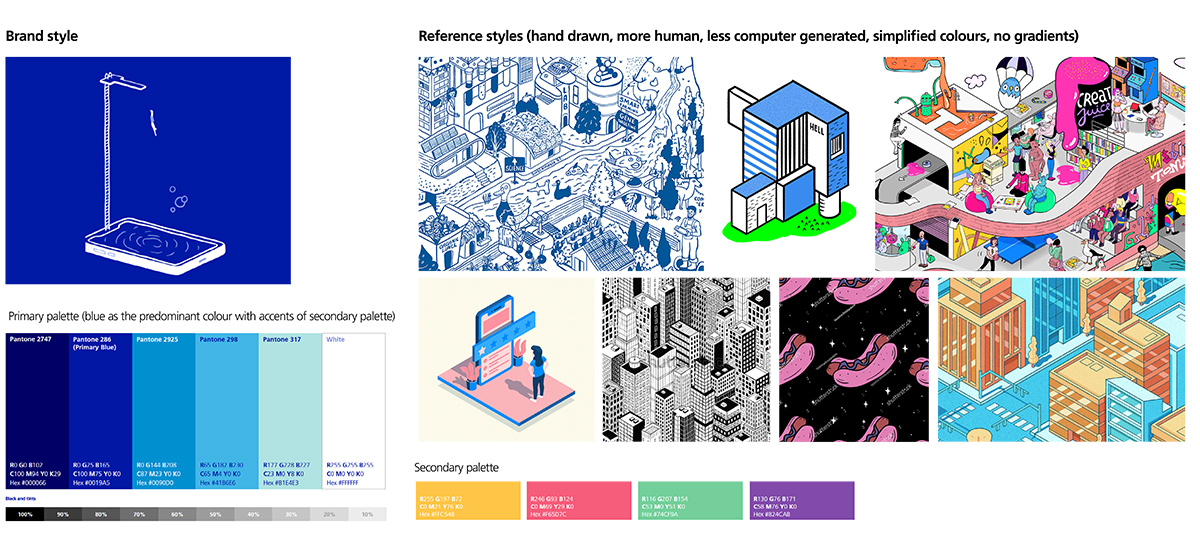
Although the illustration needed to be technically sound and spatially accurate, O2 wanted the end result to feel more human and less clinical — so part of the brief was to infuse a slightly hand-drawn quality into the work. They provided a mood board with references, brand colours, and style cues to guide the tone.
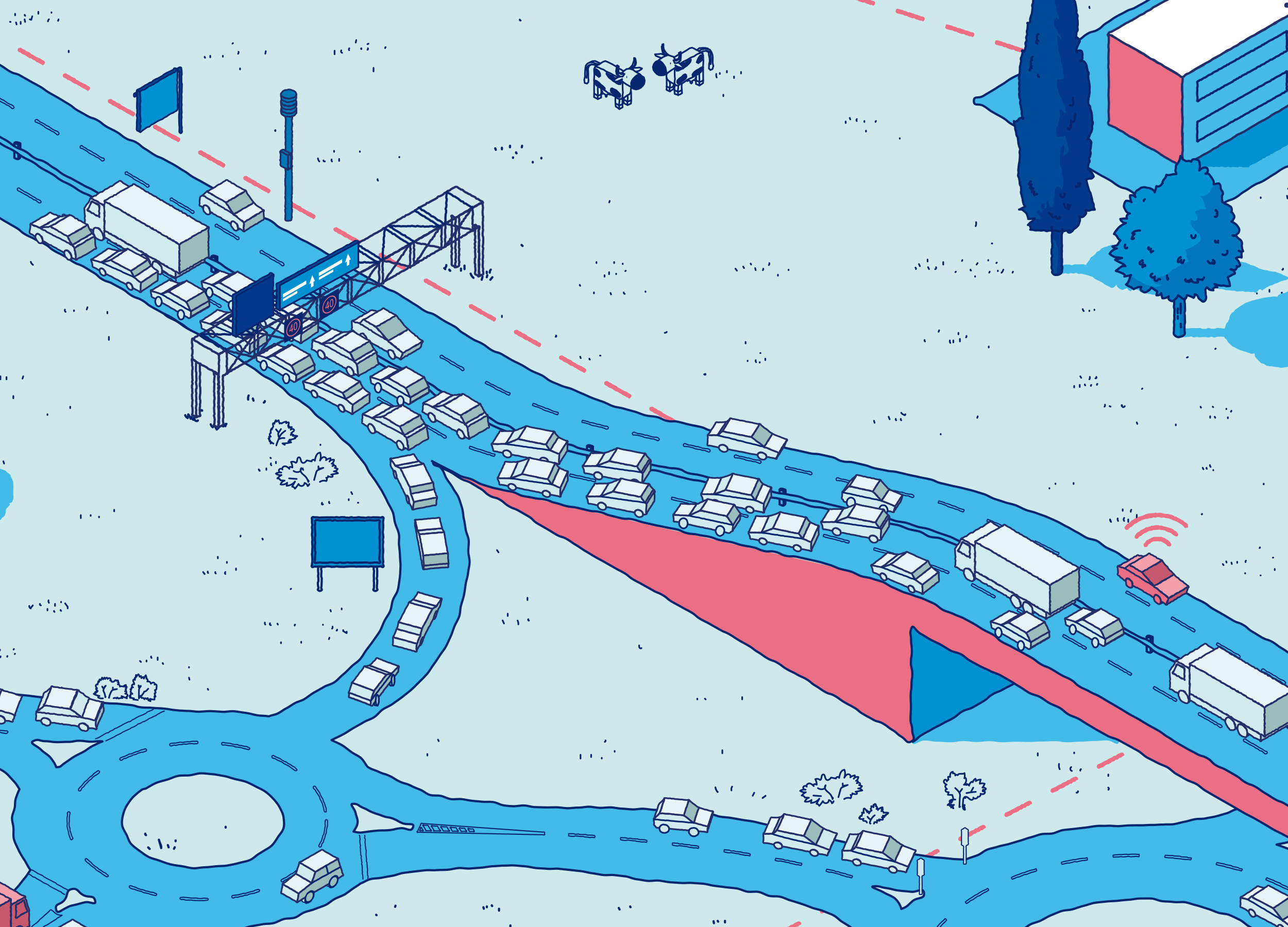
To strike the right balance, I leaned into clean outlines, solid flat colours (no gradients), and carefully simplified shapes to keep the composition readable without losing depth. Blue was the hero colour, supported by O2’s secondary palette used sparingly for contrast and storytelling highlights.
From geometry to storytelling
Every element — from the motorway layout to the positioning of officers and signage — was carefully considered to support the narrative: this wasn’t just a nice scene, it was designed to highlight four strategic opportunity areas where O2 could support Highways England.
All the illustration work was done manually in Adobe Illustrator, with no 3D software involved. It was all about precision, consistency, and bringing warmth and clarity into a structured, isometric layout.
This project was a rare blend of creative freedom and clear constraints, and the result is something I’m genuinely proud of — a poster that’s as functional as it is eye-catching, made for a brand seen by millions.