


brand identity
BTE LOG
The original company called Boccia Autotrasporti, was founded in 1920, and represents nearly a century of trust on the road. This Italian, family-run logistics company has evolved through three generations, growing from a small fleet into a national leader in road haulage and freight transport.
Today, with six strategic hubs across Italy, Boccia Autotrasporti connects ports, construction sites, and commercial businesses with a customised logistics service known for precision, speed, and reliability. With a fleet of over 100 semi-trailers of every type, they deliver on time—every time.
Shaped by speed, grounded by logic
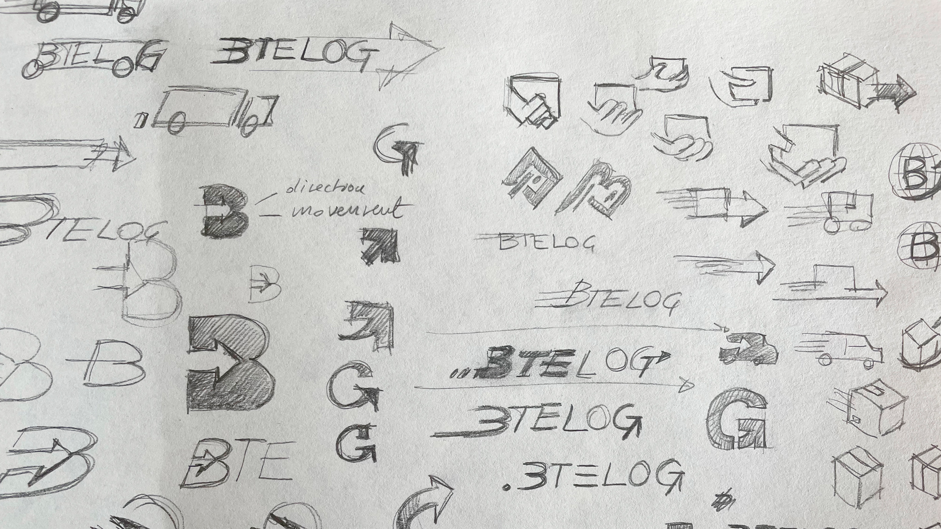
We started by exploring concepts rooted in motion, direction, and delivery. The goal was to design a visual identity that reflected the constant movement and exactitude of the logistics world.
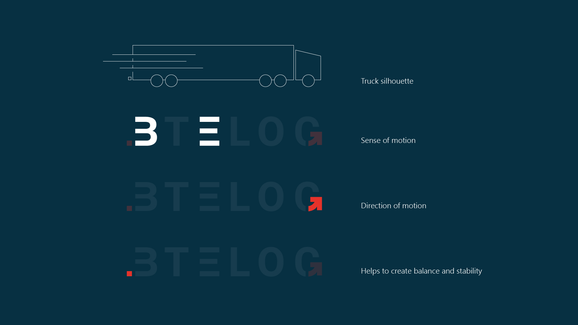
The final logo strikes a careful balance between movement and structure:
- The “B” and “E” are stripped to their horizontal strokes, suggesting acceleration, flow, and forward momentum, without static boundaries.
- The “G” features an embedded arrow, subtly guiding the eye forward and symbolising direction and purpose.
- A single dot placed behind the “B” grounds the composition, representing the point of origin, a nod to departure points, terminals, and starting places.
It’s a mark that feels strong, sharp, and in motion, just like the company it represents. Davide immediately connected with it. We both knew it hit the mark.

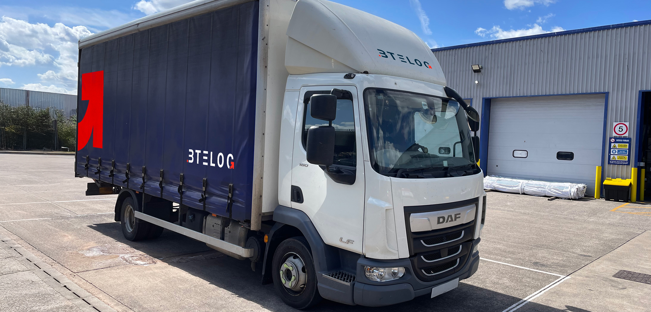
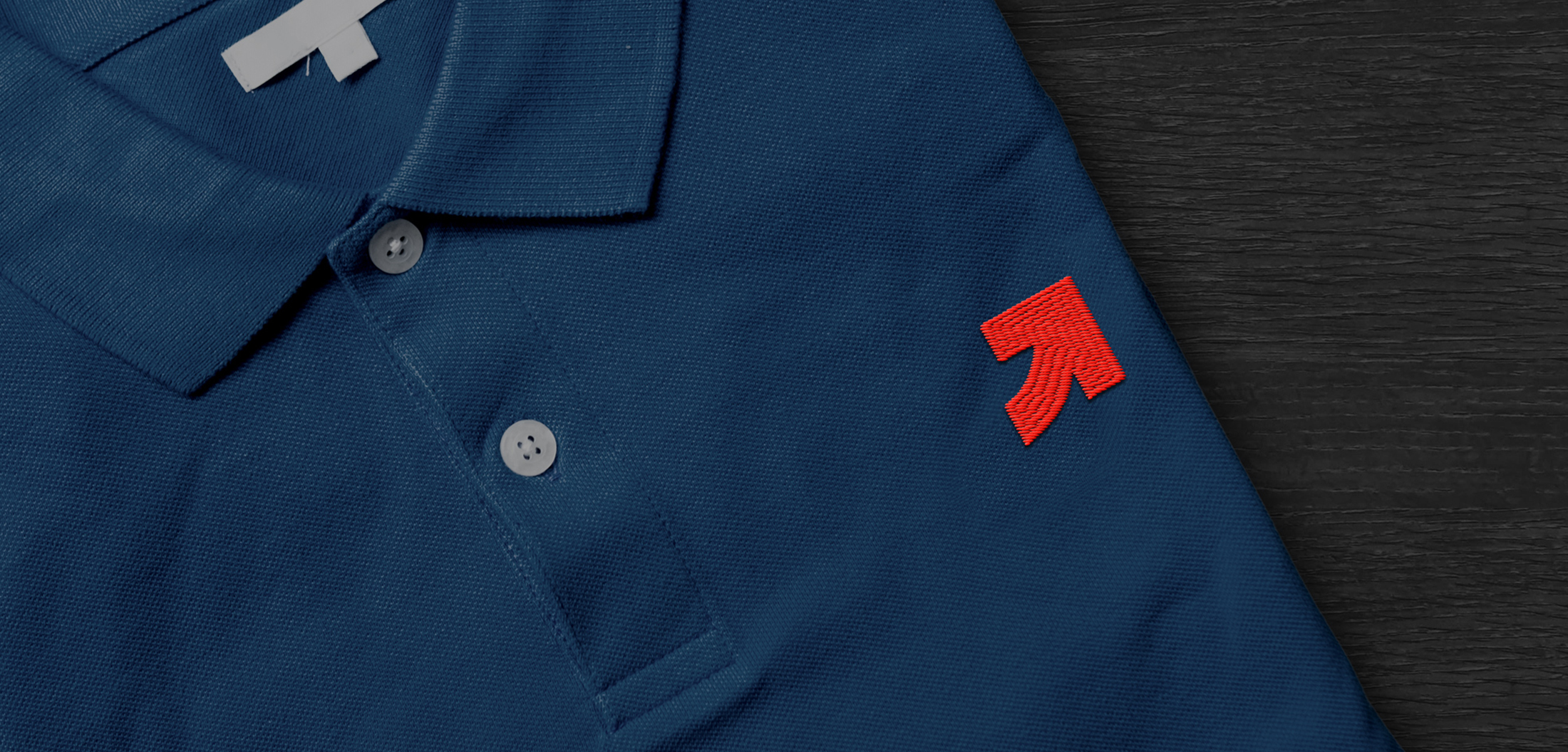
Taking the brand on the road
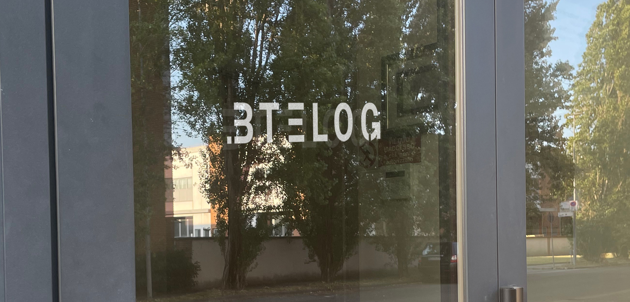
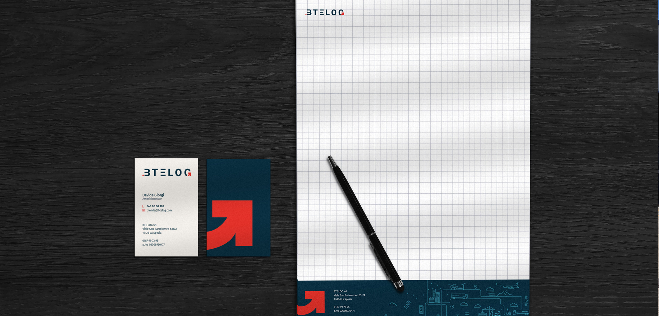
Once the logo was approved, I expanded the identity across multiple touchpoints to ensure brand recognition wherever BTE LOG shows up. This included business card design, branded notebooks for field and office use, custom polo shirt for uniforms, email signature design and, above all, large-format vehicle livery—bringing the brand directly to the roads.
The bold, industrial-inspired colour palette ties everything together, offering visibility and trust across every channel, from inboxes to highways.
Lovely words
“Our brand had been stuck in 1998, functional but flat. Igor helped us move forward without losing what made us reliable to our clients. He designed a visual system that feels efficient and up-to-date but still grounded. The team immediately adopted it, and we’re now using the new identity across everything from trucks to contracts. It’s professional, scalable, and just works, just like us.”
– Davide Giorgi –