


brand identity
Jardin Divers
Jardin Divers is more than just a flower shop—it’s a boutique atelier where creativity blossoms in every corner. Nestled in the heart of Florence, Italy, this enchanting florist evolves with the rhythm of the seasons, offering ever-changing compositions of colours, textures, and forms.
Here, flowers, berries, leaves, and branches live in harmony with carefully curated vases, woven baskets, and charming home objects—each chosen with care, personality, and a hint of playful eccentricity.
It started with a stem and a story
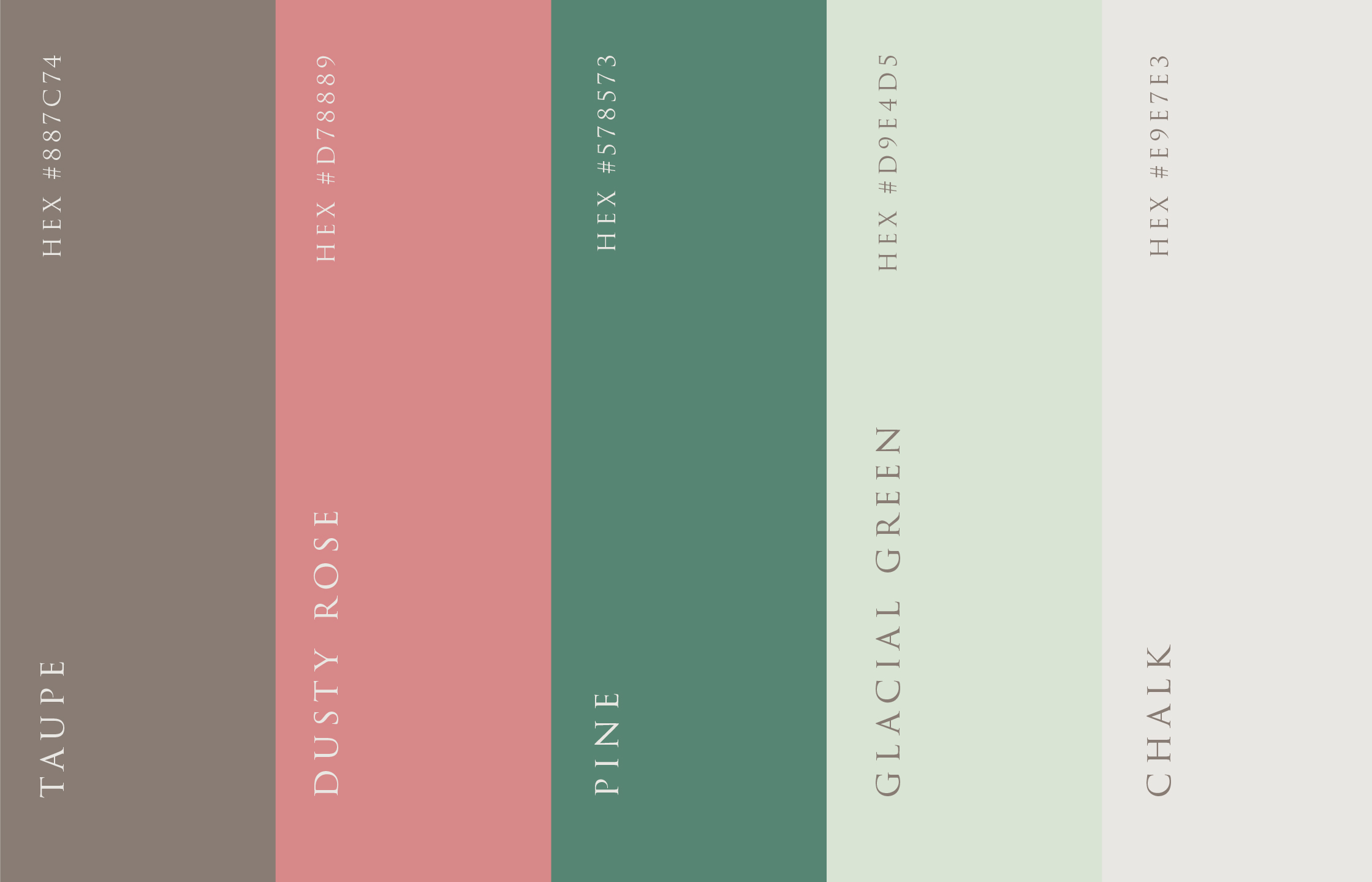
When Cendrine and Alessandro got in touch with me, I was genuinely excited to work on their brand. The subject—floristry—instantly evoked soft pastels, delicate petals, earthy scents, and quiet, beautiful moments: a handwritten note with a bouquet, the rustle of paper wrapping, the gentle curve of a stem. I knew the identity had to feel intimate, natural, and quietly elegant.
From the start, I aimed to design something discreet and refined, a visual tone that would echo the artistry of their floral arrangements. I explored several directions, but none felt quite right—none truly told their story.
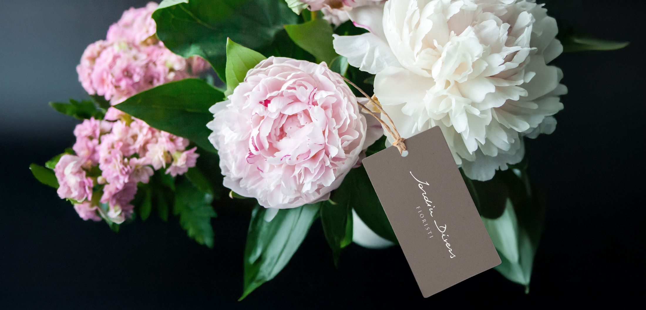
The pen did what the pixels couldn’t
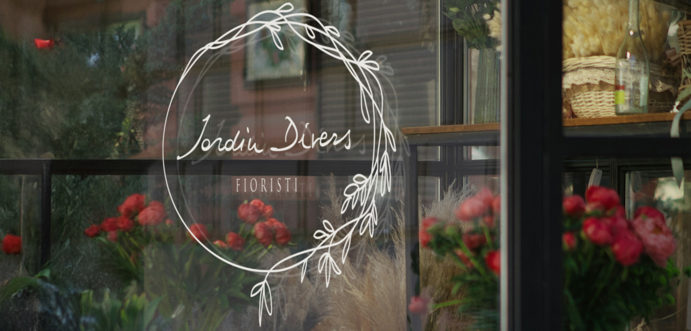
After three rounds of concepts, I decided to meet with them in person in Florence. We sat down, talked through their vision, and as we spoke, I began to understand: they didn’t want something overly polished or conceptual—they wanted something authentic. So, I simply wrote “Jardin Divers” in my notebook, as we talked.
Their reaction?
“That’s it. That’s perfect.”
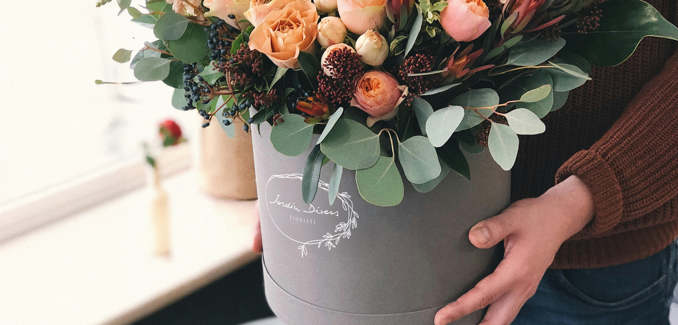
My natural handwriting, instinctive and unforced, became their logo—a personal touch that matched the spirit of their work. This project reminded me that sometimes, the best design solution isn’t the one you plan—it’s the one that feels right in the moment
Lovely words
“Igor’s process was thoughtful and deeply intuitive. He asked the kind of questions that made us pause and reflect on our own work, which, in hindsight, is probably why the final brand feels so personal. Every choice, from the shapes to the colours to the space between elements, carries the calm and beauty we try to evoke in our bouquets and flower compositions. It’s more than a logo: it’s a portrait.”
– Cendrine & Alessandro –