
isometric illustration
SAP TV
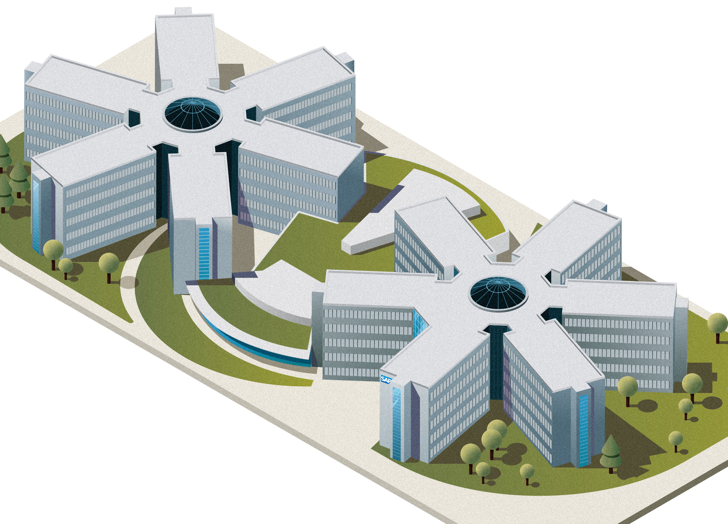
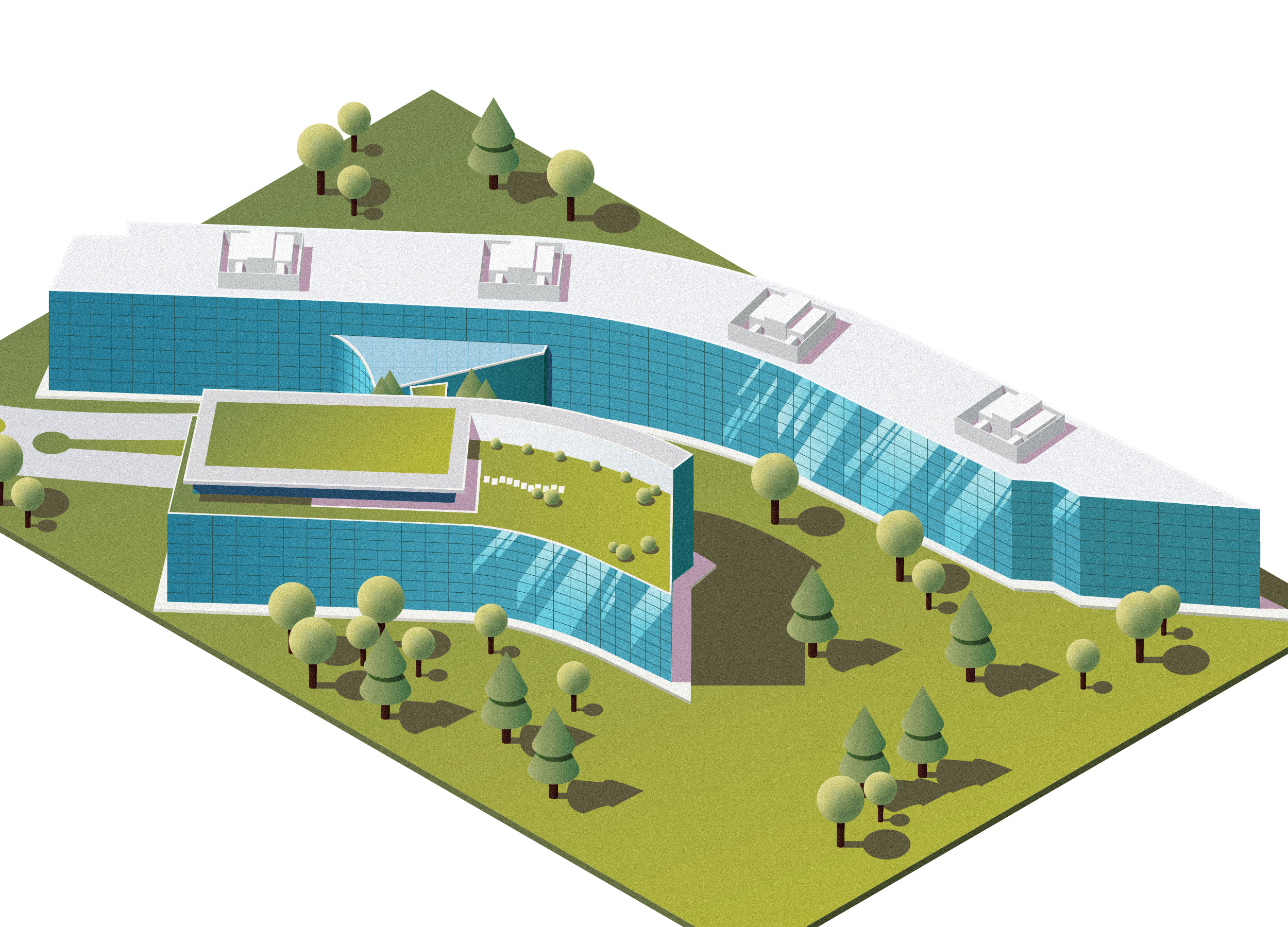
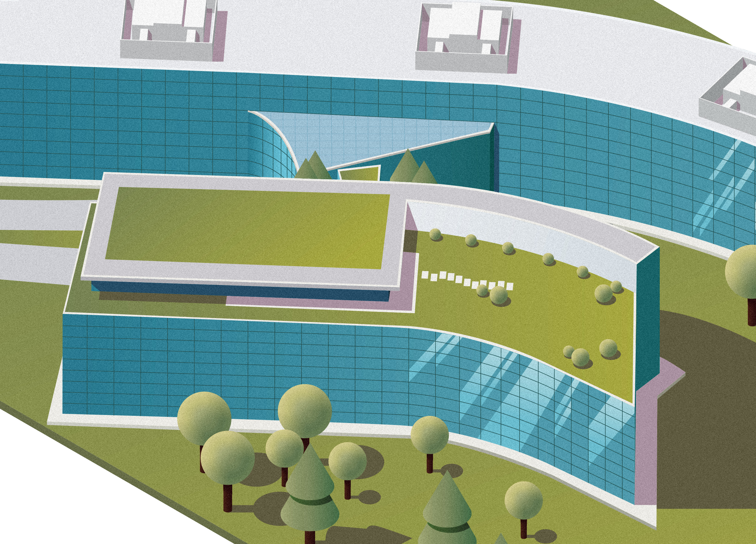
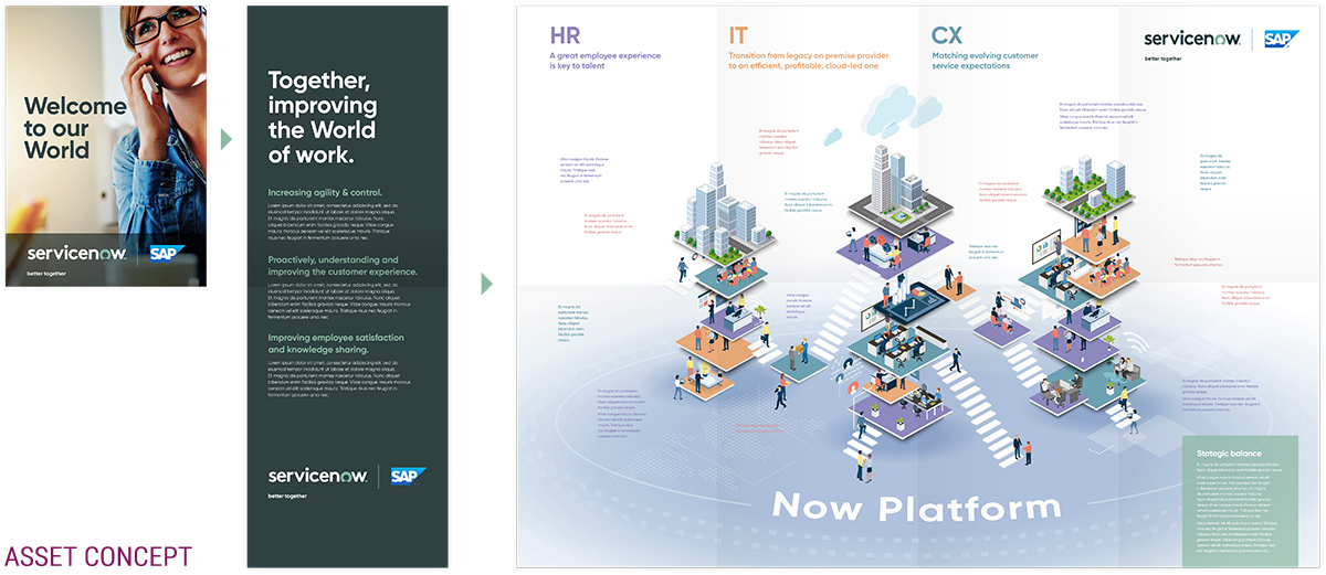
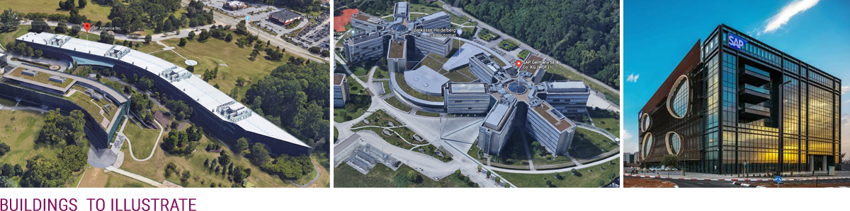
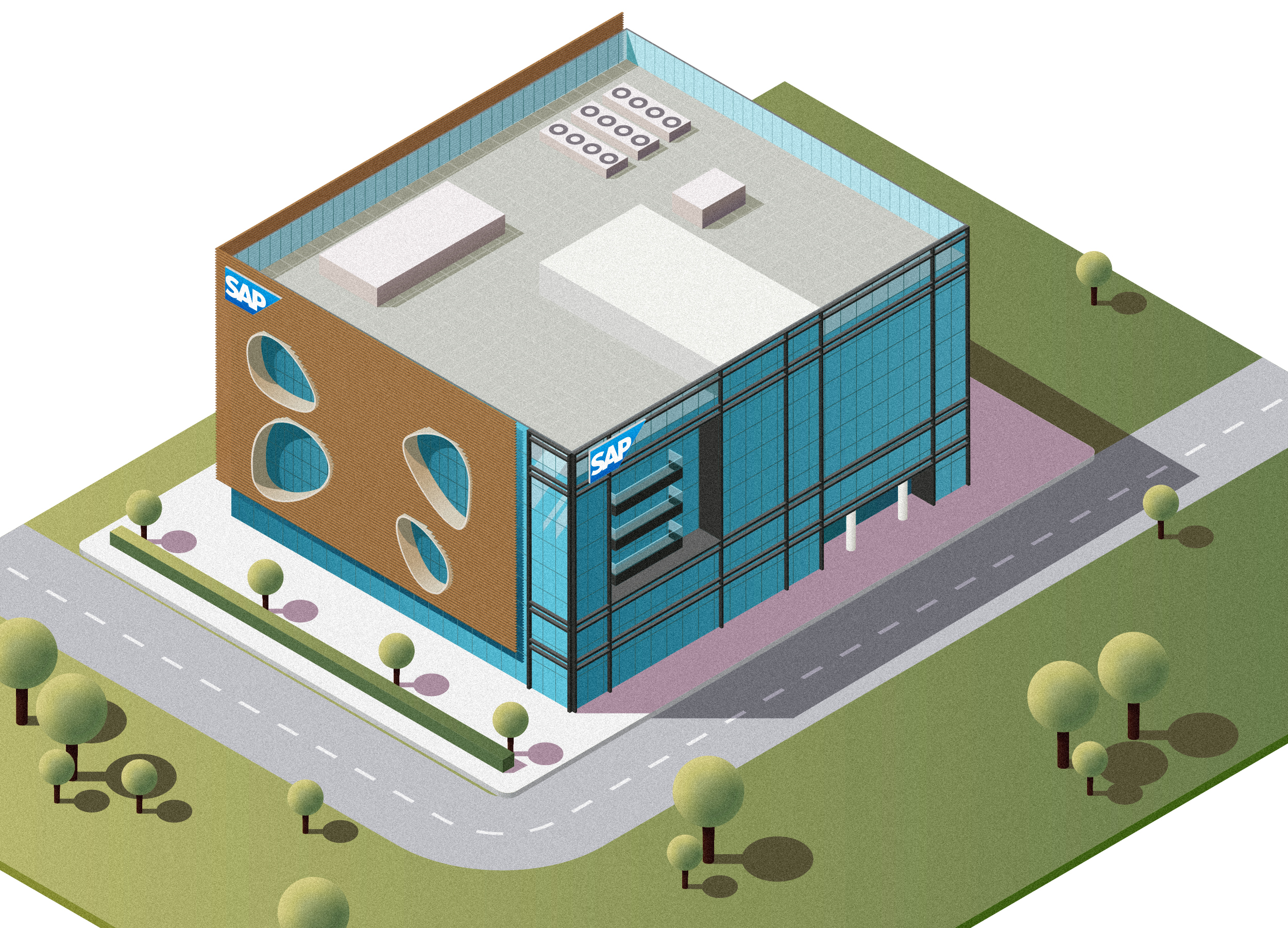
These isometric illustrations were created for SAP TV, via the team at The Marketing Practice. The brief was clear but technically demanding: produce realistic, highly detailed isometric drawings of three different buildings, each based on real-world photographs provided by the client.
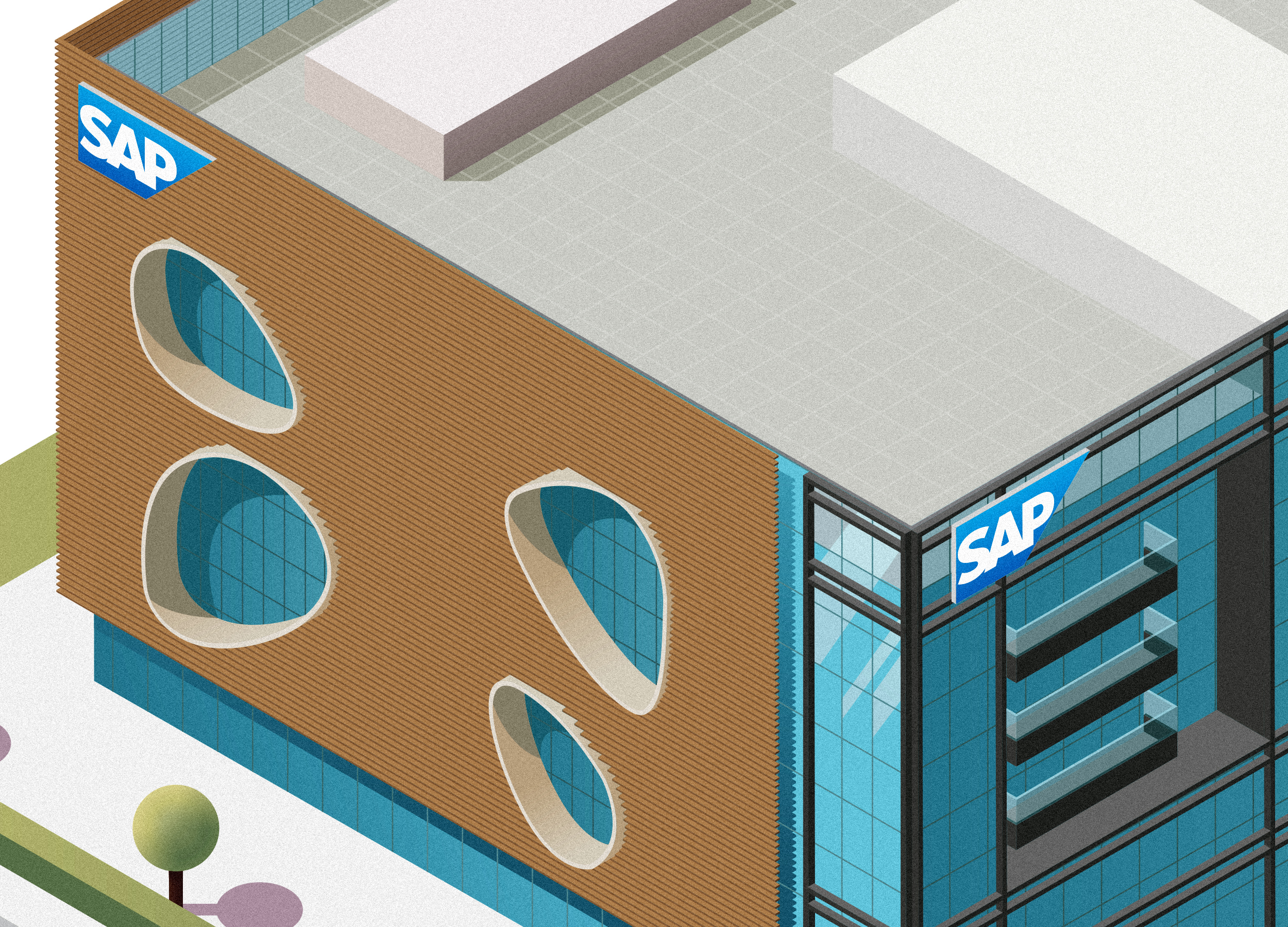
My role was to interpret these reference images and translate them into precise, clean vector illustrations — staying as faithful as possible to the original architecture, while adapting everything into a consistent isometric perspective.
No 3D, No Problem
Although the illustration needed to be technically sound and spatially accurate, O2 wanted the end result to feel more human and less clinical — so part of the brief was to infuse a slightly hand-drawn quality into the work. They provided a mood board with references, brand colours, and style cues to guide the tone.
To strike the right balance, I leaned into clean outlines, solid flat colours (no gradients), and carefully simplified shapes to keep the composition readable without losing depth. Blue was the hero colour, supported by O2’s secondary palette used sparingly for contrast and storytelling highlights.